
Covid-19 early spread
Repost of an old May 2020 article

This is the third in a series of three articles. If you are interested in seeing more data you can read the first and second articles. This article also presents a lot of data, so if you are here only looking for the conclusions head to the What I think happened section.
I’ve used a lot of maps with colour gradient in the previous articles. The reason for that is to make it easier to realize the difference in the impact of Covid-19 between different regions/states/districts within a country, to be able to see the Covid-19 hotspots (locations especially affected by the virus), and to realize where it has caused more or less cases and deaths whether in absolute terms or relative terms (per population).
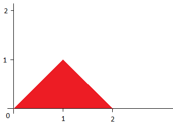
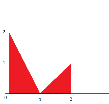
Those colour gradient maps have another nice property. They can be tought of as signal maps or probability maps in order to see what was the probability of a given event up to agiven time in a certain geographical location. Suppose you have a probability function P(x) = min(x, 2-x). That is to say:
P(0) = min(0,2–0) = 0
P(1) = min(1,2–1) = 1
P(2) = min(2,2–2) = 0
Let’s graph that function for values between 0 and 2. I promise that’s all the mathematics we’ll see in this article.
I’ll call that function probability function A, or signal A.
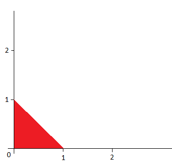
Now I’ll introduce signal V1.
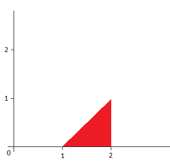
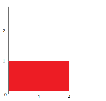
And signal V2.
You can think of those two as probability functions also. In fact you can define the sum of them V = V1 + V2, like so.
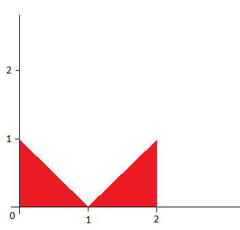
I hope that makes clear why I named them V1 and V2. You could also give different weights to different signals. Such as 2*V1 +V2. Meaning signal V1 is twice as strong as signal V2.
It’s easy to see both original signals and how they combined into the sum of both. But what if we combine our original signal A and signal V1, but with signal V1 being twice as strong.
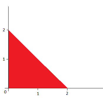
It’s a bit more difficult to see both signals. It looks more like it’s a new signal and not the sum of the signals we already knew. Now let’s try V1 + A + V2.
That looks like…. anything. And that is precisely the point. When looking at a colour gradient map, or more accurately at the observable phenomenon it represents, we could be looking at the sum of different signals which were originated by different causes under different circumstances even though those signals produced infections and deaths by Covid-19 all the same. Sometimes the different signals may look easy to recognize and tell apart, so that looking at the final phenomenon you may confidently say that it is a product of say 3*V1 + 2*A + V2. But sometimes they are much more difficult to take apart and you’ll need a lot of interpretation in order to explain how to get from the observable phenomenon, the sum of signals, going backwards to the original signals.
In the previous articles about the Covid-19 narrative I tried to present as much data as possible, hopefully in a not so tedious way, in order to show how I think that data corresponds to certain signals: tourism visitors, work related visitors, VFR visitors. Now I intend to try to bring that data together in order to show what I think is the most clear work related signal and what it implies about the current Covid-19 narrative.
Spain (putting it all together?)
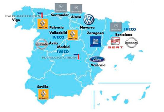
Without further ado, this is a map of car making plants for Spain.
I will ignore those of Ford, GM, Mercedez-Benz, Volkswagen, and concentrate on the rest. If you follow the news on Spain (or read my previous article on Spain) you already know that the Spanish outbreak was mostly concentrated in Madrid, and you may suspect that I’m going to name some car factory and say that one car factory, is where I think the Madrid outbreak started.
Well, you would be more or less right about naming a car factory. About it being where the Madrid outbreak started, I’m not so sure. But I have a theory.
The most affected area of Madrid seems to be its eastern area followed by its southern area (Leganés, Vallecas). This is a map of that eastern area.
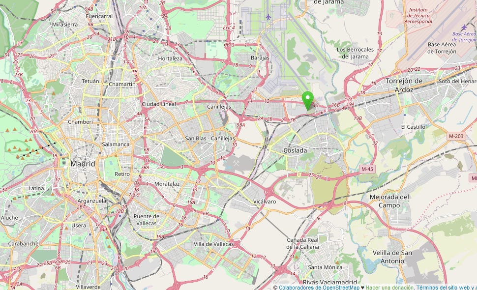
The green pin is the location of the Madrid Iveco plant, just below Madrid Barajas Airport. To the left of the map is the center of Madrid, and you can even see on the lower part of the map a bit of the Vallecas area.
But why Iveco? Why not any of the plants outside of Madrid?
First, the outbreak seems to be centered on Madrid with a much higher rate of cases and deaths than in the rest of Spain. As I’ve said in previous articles, I don’t think the differences in rates of Covid-19 cases we see now are the result of chance or unexplicable patterns of virus spread, not before lockdowns and social distancing measures were taken. I think those later (March and later) differences stem from earlier differences, and I think earlier differences (before any testing was available or being administered) were for the most part not random.
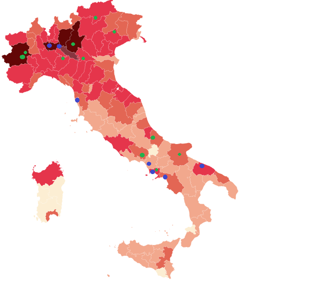
If you saw my analysis of Italy you may have thought it was a good (or not so good) partial explanation for those differences between Italy and the rest of Europe, and between Italian regions. The green dots in that map of Italy represent Fiat plants (100% owned or joint ventures). And as I said before, a possible reason the virus spread from PSA to Fiat might be the merger talks that took place (place is very important here) between them. Iveco was founded by the same family who founded Fiat, the Agnellis, and even though their ownership structure is nowadays separate they share a long history of close relationship, and to this day they are both based in Turin. I’ll get to the relationship with Wuhan later.
This is the same map of Italy, but with added green dots for Iveco plants and headquarters.
One possibility is that PSA “infected” Fiat, and Fiat “infected” Iveco. Maybe PSA “infected” Fiat headquarters, Fiat headquarters “infected” Iveco headquarters, and Iveco headquarters “infected” Iveco plants. The more links in that chain the less chance of it happening, or at least of happening early.
I think that is partly what happened, but not the whole story.
I’ll show you again the map of the Netherlands from my first article.
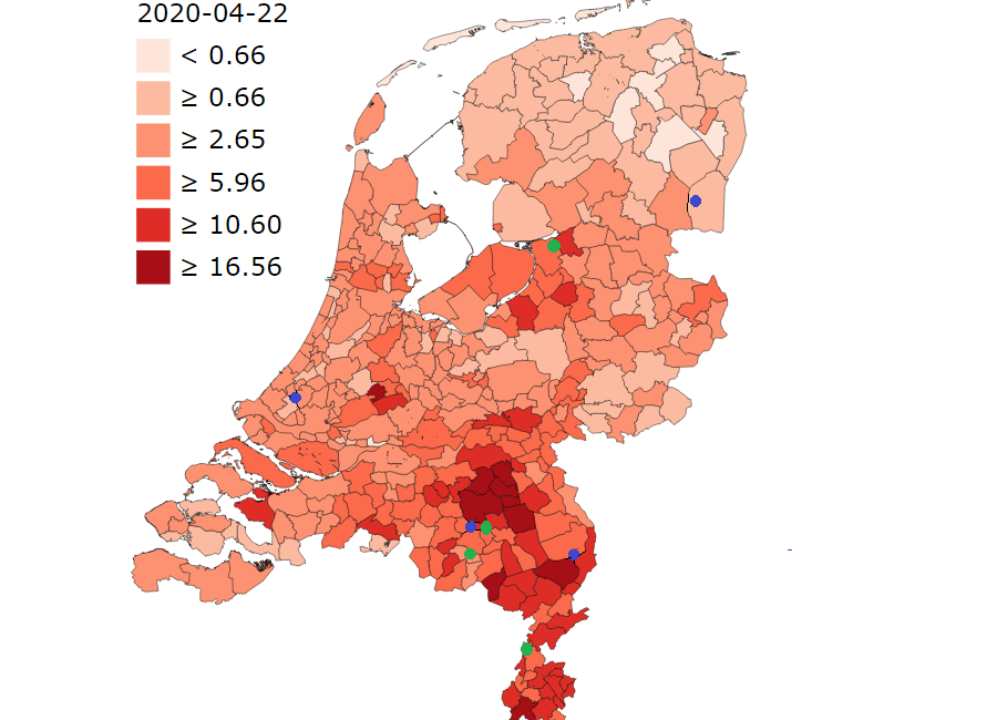
As you can see I’ve added another green dot in the northern part of the Netherlands besides the three dots that you see in the southern Netherlands. I did not explain in my first article what those three dots represented.
Those three dots represent: DAF Trucks in Eindhoven, VDL Nedcar (VDL Groep) in Born and VDL Bus & Coach in Valkenswaard. The new green dot in the north represents Scania Nederland in Zwolle and Meppel (right
next to Zwolle).
Scania also has a plant in the same Semnan province I mentioned in a previous article on Iran, and Scania headquarters is in Södertälje, Stockholm county, which is right next to Södermanland county. Both Stockholm and Södermanland county have as of now the highest rates of deaths per population of all Swedish counties, over 50 deaths per 100k people.
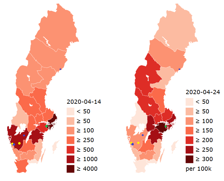
Volvo, the Swedish manufacturer of cars, trucks and buses has its headquarters and a plant in Gothenburg, besides a couple more plants in Sweden.
Let’s see those locations over a map of cases for different regions of Sweden. I’ve used green dots for Scania locations, blue dots for Volvo Trucks locations, and yellow dots for Volvo Buses locations.
Now let’s move on to Germany.
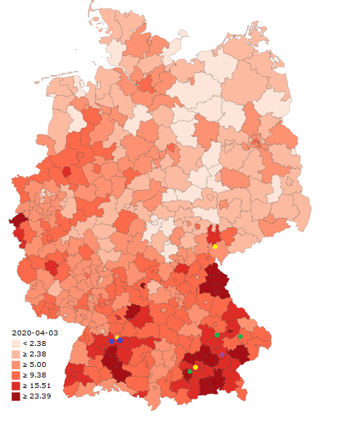
The next map shows cases by district for Germany by April 3. I’ve put a blue dot marking the headquarters of Mercedes-Benz in Germany in the city of Stuttgart, right on the limit with Esslingen district, and another one on Sindelfingen (Böblingen district). Stuttgart is one of the most affected cities in Germany, Esslingen is considered one of the hotspots in Germany, and several other districts surrounding Stuttgart also make the list.
I’ve put a yellow point in the city of Plauen, Vogtlandkreis district, where there is a “Bus modification center” for Neoplan, a bus manufacturer for MAN Truck & Bus. And another one in its headquarters in Suttgart. And another one for MAN Truck & Bus headquarters in Munich.
I’ve put a green dot on every location of Webasto-Edscha, an automotive supplier you might have heard of before because two of its employees were among the first confirmed cases of infection in Germany. These are: Stockdorf in Starnberg district, Hengersberg in Deggendorf district, Schierling in Regensburg district.
And I’ve also put a purple dot in the headquarters for Dräxlmaier in Vilsbiburg, Landshut district, a major Bavarian automotive supplier.
Now let’s move on to the United States.
The easiest explanation for the differences in how Covid-19 affected different sates and counties in the US is the obvious but unpalatable one. I’ll quote the Washington Post:
Interestingly, all five of these counties are uniquely suffering the consequences of the coronavirus pandemic.
I will not dwell much on the obvious correlation between the size of the Chinese community in a certain location (New York, Seattle, Boston, California, etc…) and the magnitude of the epidemic there. But I’ll make a couple of points.
Paccar is one of the biggest truck manufacturers in the world, having a portfolio of three major brands: Kenworth, Peterbilt and DAF Trucks. You might remember DAF Trucks is headquartered in Eindhoven (the Netherlands) with a plant in Westerlo (Flanders region of Belgium) close to the Volvo trucks plant in Ghent.
Kenwort is headquartered and has a major manufacturing plant in Seattle (King county). This might just be a coincidence, considering how somehting like 4% of the population of King county is of Chinese descent. A second Kenworth plant is located in Chillicothe, Ross county, Ohio, 12 km away from the limit with Pickaway county which is a hotspot in Ohio. There is also a Kenworth plant in Sainte Thérèse near Montreal in Canada.
Peterbilt is headquartered and has its (only?) manufacturing plant in Denton, Texas.
The second point I want to make for the US is that the correlation between the magnitude of the epidemic in a certain location and the size of the Chinese American community in that location has a very clear problem. I tried to illustrate this problem in my previous article using a Galton Machine.
If a certain county X has a Chinese community of 50,000 people, and 1% of that community actually has ties with Wuhan, that leaves us with a group of 500 people who might visit Wuhan or receive visits from friends and relatives from Wuhan. The number of Chinese visitors to the United States is aproximately 3 million every year and the Chinese American population is 4.2 million, so that gives us 1.4 visits for every Chinese American person per year. I’ll assume half of those visits are actually VFR visits and that they are evenly distributed throughout the year, giving an average of 0.013 visits per week per person, and a total of 6.7 visits per week for county X.
Between January 31 and February 2 the US suspended flights from China and banned anyone who had been in China within the previous two weeks. That means the “window of opportunity” for someone to inadvertently bring the virus from Wuhan into county X was 2 to 3 weeks at the most. That is 2 to 3 weeks under the current narrative for the virus. The current narrative also implies that no more than 5% of the population of Wuhan would have been infected by the time Wuhan was locked down. It’s hard to see how the distribution of cases/deaths would closely follow the distribution of Chinese American communities given those assumptions.
Update: I’ve analysed some of the data for Eastern Europe, but I’m not adding it here in order to keep this article as short as possible.
What I think happened
If all this points to a relationship between different manufacturers of trucks (and maybe buses), what is that relationship ? And what connects them all, and connects them to the virus?
This is a list of several trade fairs for the automotive industry held during the last months of 2019.
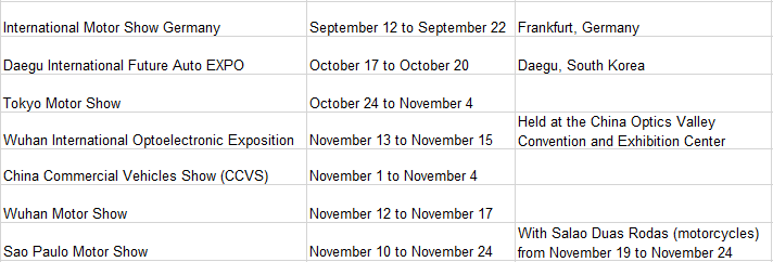
First I want to focus on the Wuhan Commercial Vehicles Show (CCVS) that was held between November 1 and November 4 in the Wuhan International Expo Center. Besides Chinese manufacturers present at the show, including of course Dongfeng Trucks, foreign manufacturers present at the show included Mercedes-Benz, Scania, SAIC-IVECO, Michelin, and Palfinger.
At this show were present most of the manufacturers I’ve named in this article and previous articles. Which seems only natural, because I couldn’t find many more trade fairs for commercial vehicles, trucks in particular, that seemed to be as big as CCVS: Elmia Lastbil (Jönköping, Sweden), Transport Compleet (Gorinchem, Netherlands), IAA Commercial Vehicles ( Hannover, Germany). And CCVS appears to be the only commercial vehicles trade fair in China and the biggest in Asia.
At first I thought the Wuhan Commercial Vehicle Show included buses, trucks and even tractors manufacturers. But if you take the case of Volvo in Sweden, the “signal” for Volvo Trucks (blue dots) appears to be much stronger than for Volvo Buses (yellow dots), and I’ve found no detectable signal for companies that manufacture only buses. This coincides with a “picture analysis” from pictures found on the internet. These pictures are from the 2017 version of the show and they seem to point in the direction of the show being mostly trucks (trailer, refrigerated, loader cranes, etc…), not buses.
As you can probably guess by now, I think there is a very high probability that some of those visiting CCVS (from Scania, Mercedes-Benz, IVECO, etc…) got infected with Covid-19 while in Wuhan and carried the infection back to their home countries. In fact back to the headquarters, offices and eventually some factories of their respective companies. I think the signal for the outbreak in Spain beginning in the Iveco Madrid plant (and partially in the PSA Madrid plant) is very strong.
If you read the article where I talked about the Covid-19 outbreak in Brazil and what “signal” it seems to show, then you will not be surprised to hear how I think the virus arrived in Brazil. I think one infected person (or more than one), probably infected while taking part in the Wuhan Motor Show, subsequently went to the Sao Paulo Motor Show (same industry, same segment, some of the same manufacturers) and spread the virus there.
I also think work related visits by PSA and Renault to their respective Wuhan factories (I’m not so sure about their particpiation in the Wuhan Motor Show) spread the virus from Wuhan to their factories in France and maybe to related factories in Madrid and Italy. I will not review the data about France here, but you can check my first article and see if the data makes sense.
I think these work related “signals” combined with the tourism visitors and VFR visitors “signals” match the data for Coronovirus spread better than the current narrative.
So what is the biggest problem with this story? it contradicts the timing of the current narrative for the spread of the virus. It would mean the virus was already prevalent enough in Wuhan by the first days of November so that a few visitors to CCVS could get infected and carry the virus back to their countries.
I’m aware of the saying “extraordinary claims require extraordinary evidence”. I don’t think what I’m claiming is extraordinary but it definitively deviates from the current narrative for Covid-19, and I hope to have provided enough evidence to back it up.
Update: I’m not the only one who thinks the current narrative might be wrong and the virus began spreading earlier.
What about the spread of the virus?
Changing the timing might also affect calculations for how fast Covid-19 spreads or for its R0. I’m not an epidemiologist and so I can’t really give an informed opinion on that. But yes, I think the spread of the virus was slower than has been generally assumed and we didn’t realize it because nodody was looking for it.
When I started writing these articles the consensus value of R0 for the Covid-19 was something between 5.7 and 1.4. The 5.7 value seems to come from studies based on data from Wuhan assuming the virus started spreading in mid December. The consensus now seems to be leaning towards a value between 2.0 and 3.3. All other things being equal, a value of R0 much lower than 5 means a slower spread.
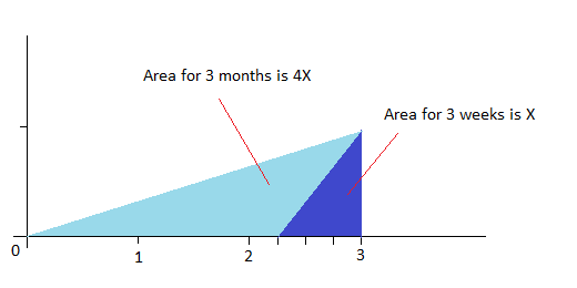
The calculations for the spread of the virus that I’ve made in these articles are based on a value for R0 of 5, and an average length of the desease of 14 days (similar to the serial interval parameter). And even with that value of R0 it’s difficult to reconcile the data for deaths/cases with the current narrative. With a lower value of R0 (slower spread) I think it’s nearly impossible to reconcile both. A slower spread means it’s impossible to go from 1 infected person to 1 million in two months. Not even in three months. I hope the next graph makes clear why a slower spread and an earlier time for the beginning of the outbreak seem much easier to reconcile.
How sure am I of these claims? I’m not 100% sure. Maybe not even 90% sure, but I think there are clear problems with the current narrative for how the Covid-19 epidemic spread and that is why I suggest a different narrative which I think matches the data better.
I hope these articles stimulate a healthy discussion about these issues, and I also hope to receive criticism. I would welcome anyone presenting data that contradicts or supports this narrative.
Update: limitations and playing devil’s advocate
I’ll try to flesh out the limitations and weakest points of the arguments I’ve made and data I’ve shown in these articles in order to help me address them clearly, and if necessary correct any errors I might have inadvertently commited.
First, I don’t have all the data I would like to have. I would like to have more fine grained data that would allow me to pinpoint a Covid-19 hotspot to a precise geographic location instead of a region or province or county, but the level of detail varies by country. For some countries (New Zealand for instance) cases and deaths are grouped by Distrct health boards which don’t coincide with its Regions, making it difficult to calculate cases or deaths per population. This would allow me to check for instance whether the very high incidence of Covid-19 in the Territoire de Belfort departement of France can actually be attributed to the PSA factory in Sochaux right next to its border with Doubs, or whether that is just a coincidence.
Second, not all data is equally reliable. Some countries might stop counting all deaths when they can hardly keep up with the level of hospitalizations they are facing. Some countries just don’t have the capacity to do the necessary tests to realiably attribute pneumonia deaths to Covid-19 or other infection. I’ve tried to aknowledge this fact whenever I thought there was good a chance of this being the case.
Also, I’ve assumed that weather plays a large part in explaining the differences between countries and regions of those countries, related to Vitamin D, temperature or other cause. You might think of it as another signal (or more of a factor) to be taken into consideration besides the ones I’ve talked about. I know that as of this moment this is not yet the consensus, and it might happen that this is disproved in the next months. If that were the case I agree that a large part, but not all, of the analysis I’ve made would be wrong. But I’ve applied the same kind of analysis that I’ve done for flows of people to the weather and I think it does point in that direction.
As I’ve said before this whole analysis tries to track the spread of the virus before any measures were taken to arrest its spread. This might be end of January for some countries, early March for others, etc… The fact that some particular countries took measures that diverged from those taken by most others, for instance Sweden, makes it useless to do comparisons between those particular countries and others, say Sweden vs Norway, with data from April and beyond. But it doesn’t eliminate the possibility of doing useful comparisons between regions of those particular countries.
A few countries or regions simply do not fit with the analysis I’ve made. The ones I think clearly fall into this category are: Ecuador, particularly Guayaquil. The northern caucasus region of Russia, particularly Ingushetia.
I don’t have a good explanation for these instances, besides the easy explanation of randomness and bad luck. Someone infected just happened to go from Wuhan to Guayaquil early in the outbreak, when nobody knew about or was testing for this, and the virus had a lot of time to spread in Guayaquil even if slowly because of the weather… that might be the correct explanation, but for me it leaves much to be desired. To a large degree I’ve made this analysis in order to rule out the easy explanations for these differences between countries: misinterpreted randomness, cheer luck, and containment measures which can explain later developments but not how different countries had very different early outcomes.