
A follow-up to my child poverty post: it's worse than I thought.
It's worse than I thought.

My recent post about UNICEF’s child poverty ranking (the Innocenti Report Card 18) was supposed to be a standalone post. I didn’t think any follow-ups would be necessary.
UNICEF's Child poverty ranking ranks very poorly

I can’t remember where I first read about UNICEF’s Innocenti Report Card 18. It’s the kind of public report made by a well-known and respected international organization that is easily quotable by well-intended persons or organizations who want to spotlight serious but neglected problems in the world. The problem is child poverty in wealthy countries.
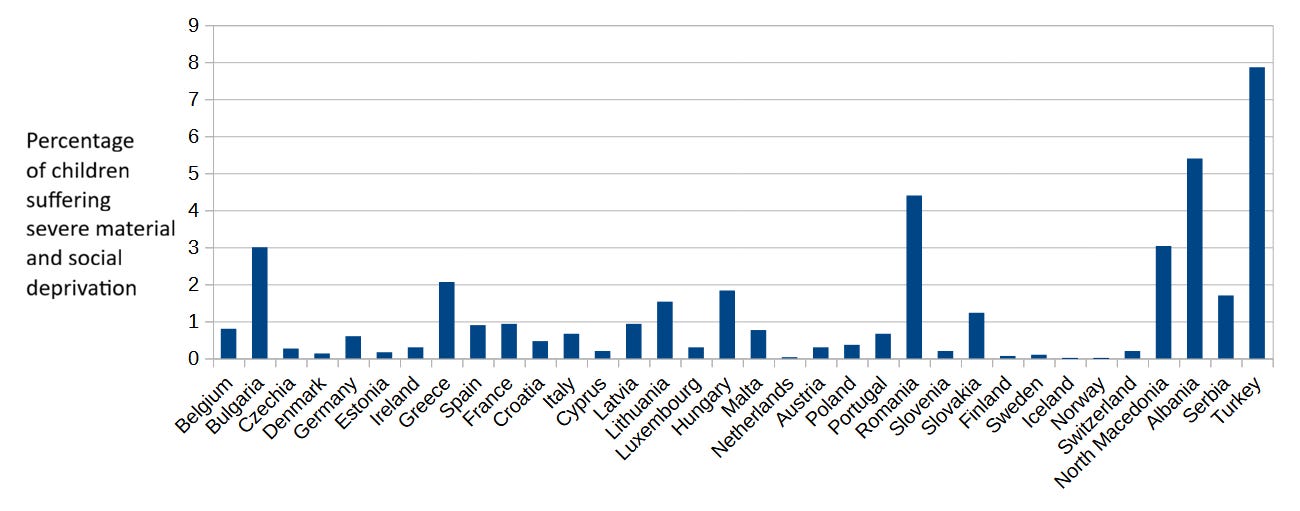
I wrote about how this ranking is deeply flawed: the index it’s based on does not truly measure child poverty in wealthy countries. Unfortunately, it’s much better known than Eurostat’s more helpful Severe Material and Social Deprivation index, which more accurately gauges whether children experience material deprivation in their households.
A limitation of the Eurostat index though, as its name suggests, is that it only publishes data for European countries, and this makes it unsuitable for comparisons among countries whenever one of the countries involved is not part of Europe. Not a big deal. I didn’t intend to compare child poverty rates between poor or middle-income countries anyway.
Yet in a later comment to the post, I noted that the Oxford Poverty and Human Development Initiative (OPHI) at Oxford University, in partnership with the United Nations Development Programme (UNDP), produces a multidimensional child poverty index (MPI) that includes material conditions as one of its dimensions and is not restricted to a sample of wealthy countries. In fact, OPHI produces the index for 109 countries in total, including 14 Latin American ones; it comes as no surprise that Our World in Data relies on it as a source on poverty.
The index is calculated by grading households on a scale of deprivation and classifying everyone, adult or child, living in a household above a certain deprivation threshold as poor. The MPI value for a given age group can then be obtained by multiplying the share of people living in poverty in that cohort (e.g. children) by the deprivation intensity of the households they live in. Therefore, we can not only compare child poverty rates across countries surveyed by OPHI, but also compare child poverty rates to adult rates within each country, which is precisely what I did.
The outcome of this comparison confirms a result presented by UNICEF’s Innocenti report - maybe the report wasn’t all bad after all: child poverty is more prevalent than adult poverty. Moreover, the average MPI poverty index value for children aged 0-9 is 56% higher than for those aged 10-17. A sad state of affairs, given that children are the most vulnerable members of society.
Here are some selected MPI values, so you can get an idea of how poverty varies across age groups and countries.
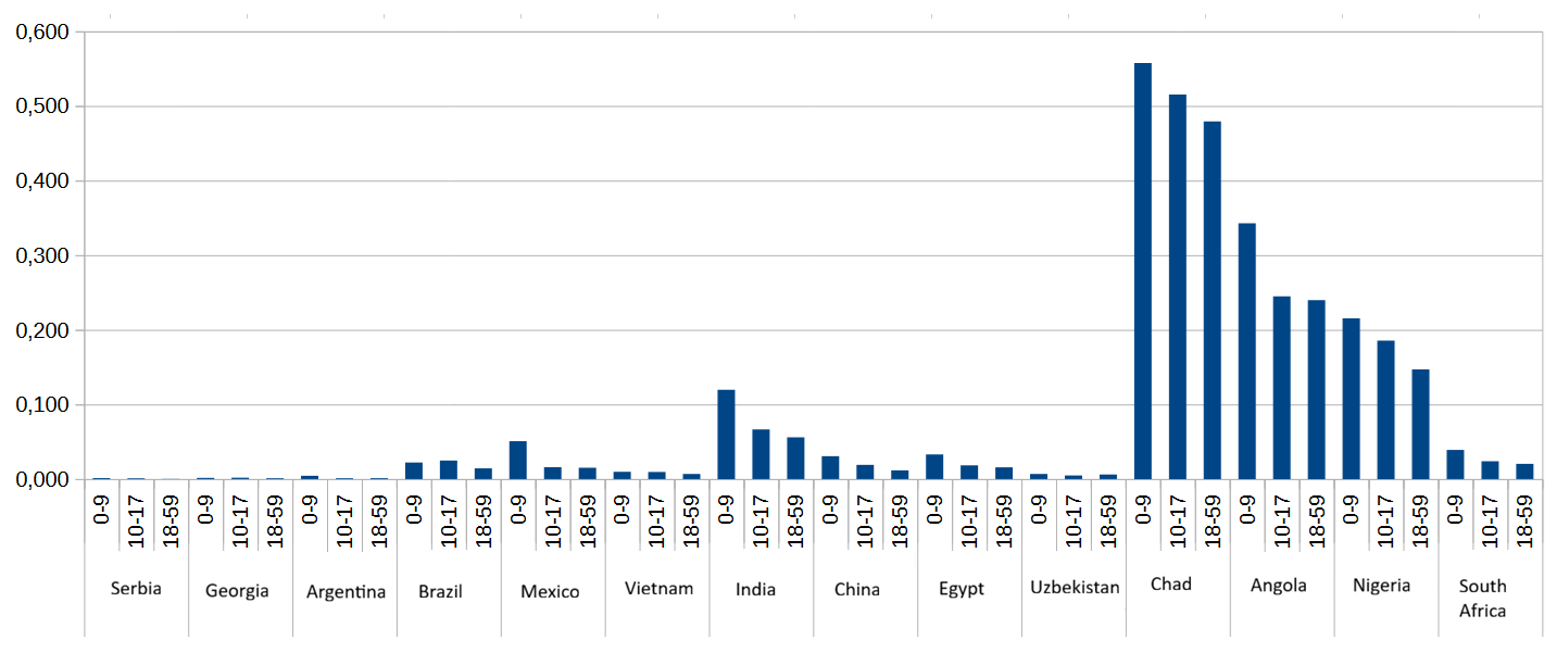
Notice how some regions of the world tend to have higher MPI values than others (Sub-Saharan Africa in particular). And this same regional pattern holds when we examine only the share of population living in poverty (no deprivation intensity) in each age cohort for the same set of countries.
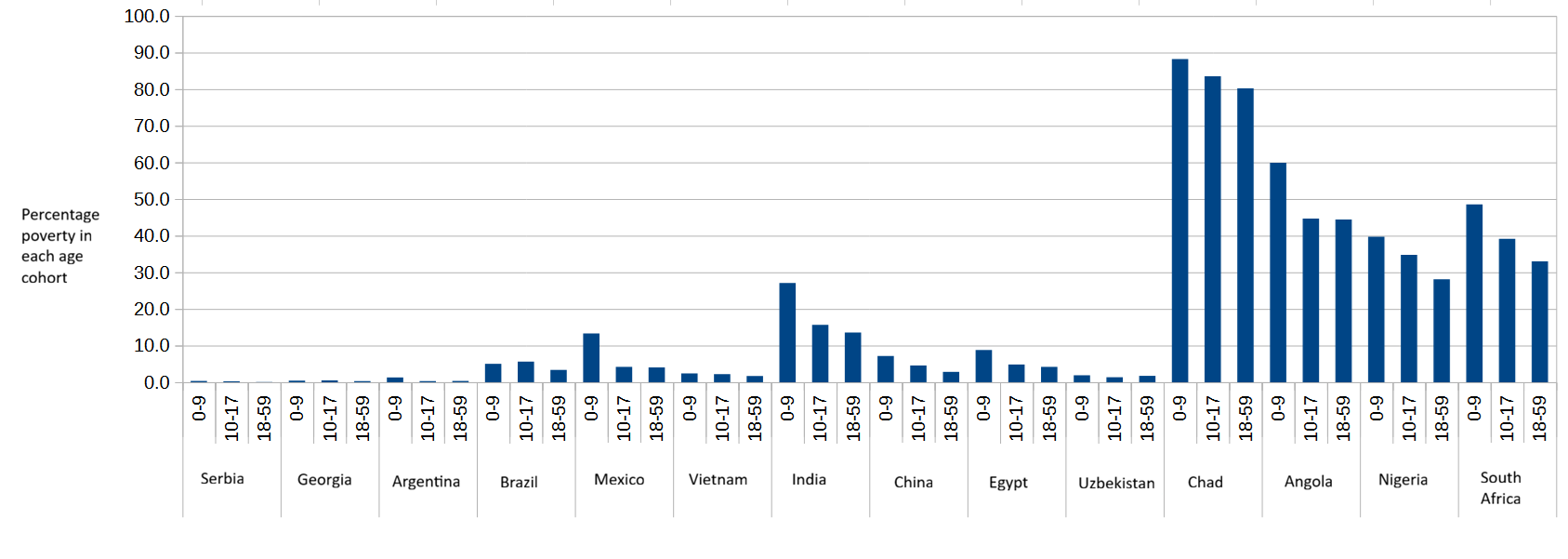
Although you can barely see Serbia’s percentage bars in the above chart, the country’s child poverty in the 0-9 cohort is 6.7 times higher than its adult poverty rate. This is an extreme case, but illustrative of the large gap between child poverty and adult poverty that the MPI reveals.
What does multidimensional mean?
I’ve already mentioned that one of the three dimensions comprising the Multidimensional Poverty Index is material conditions of the household (living standards). The other two dimensions, each contributing one third to the MPI index, are health and education.
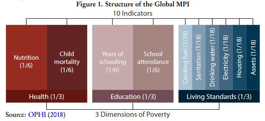
In turn, both health and education dimensions are made up of two indicators, each weighing one sixth, which are defined thus:
Nutrition: Any person under 70 years of age for whom there is nutritional information is undernourished.
Child mortality: A child under 18 has died in the household in the five-year period preceding the survey.
Years of schooling: No eligible household member has completed six years of schooling.
School attendance: Any school-aged child is not attending school up to the age at which he/she would complete class 8.
Notice that these four indicators are evaluated at the household level, which partly explains why child poverty rates are higher than adult poverty ones: the larger a household, the more likely that at least one member will be considered deprived in any of the four indicators. Since households with children typically have more members, they are more likely to be classified as poor, all else being equal1.
So maybe the gap between child poverty and adult poverty is not as wide as it first appears.
Let’s now take a closer look at the education and health indicators, beginning by child mortality, and see if we can understand child poverty rates a little better. First, the definition of child mortality used by MPI is not the definition you might be familiar with. The standard definition counts yearly deaths of children under the age of five, while MPI counts all deaths under the age of 18 in the last five years. Since children are more likely than adults to live in households where other children also live, it should come as no surprise that children will be more likely to live in a household where an under-18 child died in the last few years. As a result, the child mortality indicator is consistently higher for children than for adults: as high as 4.35% for Argentine children aged 0-9, 4.4% for Serbian children (0-9), and 12.77% for Nigerian children (0-9).
Secondly, while child mortality is clearly correlated with poverty, this correlation is far from perfect. Children under five may die from causes wholly unrelated to poverty, decreasing the usefulness of this indicator as a good measure of deprivation, and the expanded age range used by OPHI (18 years) amplifies this problem by capturing even more deaths unrelated to poverty.
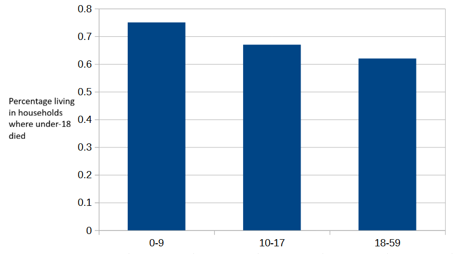
To illustrate this effect, consider murder rates. Latin American intentional homicide rates are some of the highest in the world, with Ecuador currently holding the top spot: 45.7 intentional homicides per 100,000 population. According to the MPI2, 0.75% of Ecuadorian children aged 0-9 live in a household where an under-18 child died in the past five years, while the same rate for children aged 10-17 is 0.67%, and for adults (18-59) is 0.62%.
The small drop from the 0-9 rate to the 10-17 age group, and then further to 18-59 adults, is unsurprising3. Nothing unusual with Ecuador’s child mortality indicator, apparently.
Before examining the MPI child mortality rates in other Latin American countries, let’s see what the United Nations Office on Drugs and Crime (UNODC) reports about murder in the Americas in its 2023 Global Study on Homicide.
The overall homicide rate decreases with age, with the sex disparity increasing sharply after the age of 14 years. The preponderance of male victims starts to become apparent from 10-14 years of age in the Americas, while in Europe this is the case from 18-19 years of age... In the Americas, young men are particularly at risk of homicide related to organized crime and gang-related violence.
In the Americas, murder rates by victim age sharply increase several years before reaching adulthood, which means many homicides are correctly classified as child murders. This is not directly related to poverty. As you can see in the following charts, the gap between child homicide rates, particularly among boys, and adult rates in the Americas is relatively small compared to the larger gap between children and adults in Europe.
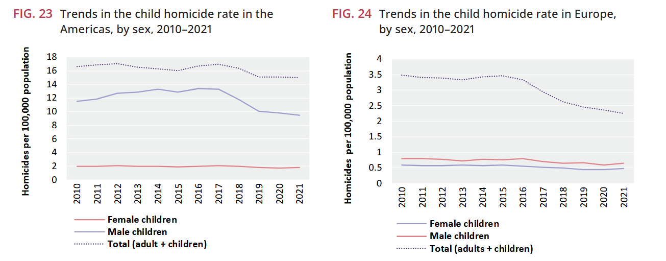
Teenage boys in Latin America are being killed at a strikingly high rate compared to boys in other regions of the world.
This unfortunate state of affairs is apparently reflected in the MPI child mortality index for the 10 Latin American countries with the highest murder rates. Brazil, Costa Rica and El Salvador show higher child mortality rates among children aged 10-17 than children aged 0-9. Conversely, three other countries (Honduras, Colombia and Guatemala) show the expected rate drop from aged 0-9 to 10-17, while the four remaining countries were not included in the MPI or did not report child mortality data.
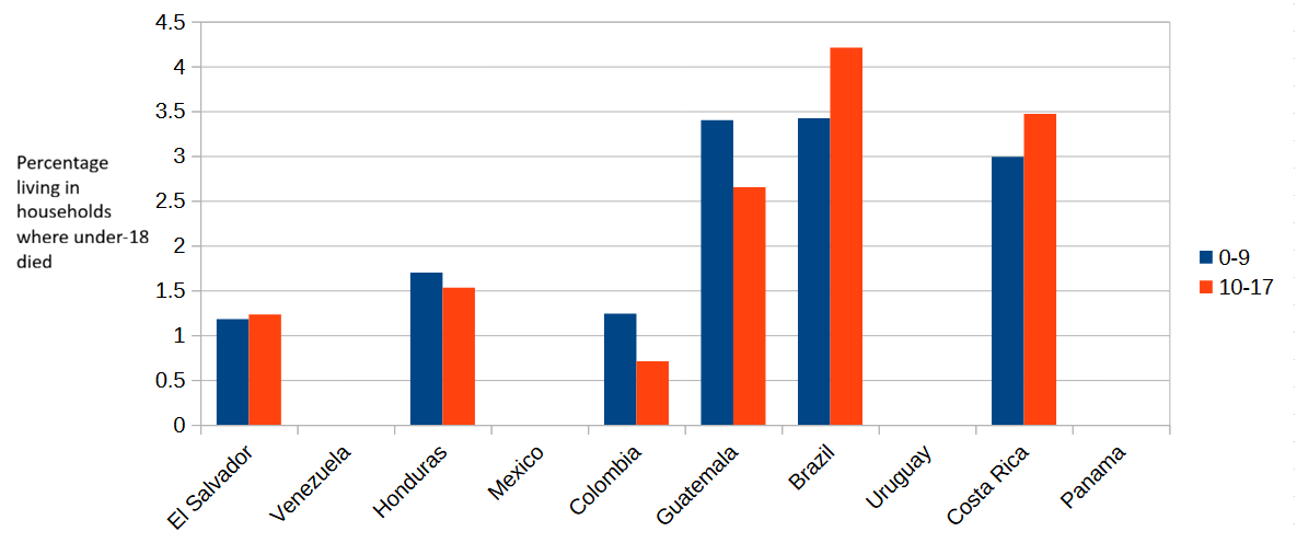
These seemingly surprising 10-17 child mortality rates are not so surprising if we assume that children in that age range are more likely lo live in a household with another 10-17 child than with a younger 0-9 child. In other words, children aged 10-17 have a higher likelihood of living in a household where another 10-17 child was murdered in the past five years4.
Let’s go back to Ecuador.
As you can plainly see in the chart of the 10 Latin American countries with the highest murder rates, I cheated: Ecuador is not among them. And what’s with El Salvador? Didn’t the Central American country experience a dramatic drop in its murder rate in the past few years?
The reason you see El Salvador in the 10 highest murder rates country list, and not Ecuador, is that the list I’m using is Wikipedia’s List of countries by intentional homicide rate, compiled in 2022 based on data from 2016-2019 [UPDATE: I should have probably used the Wikipedia list from 2019, based on homicide data from 2016-2017. It differs from the list I used in that Uruguay (not in MPI) is replaced by the Dominican Republic]. And the 2025 MPI index uses survey data collected between 2014 and 2019. If I relied on more recent murder rates, I would be comparing murders that took place in a given time period with their presumed effect on child mortality rates of a different period.
And my motivation for drawing attention to the child mortality rates of Ecuador and El Salvador is not simply to highlight that MPI uses not so recent data. The more important point is that in a future update of the MPI Ecuador and El Salvador might switch places, at least on the child mortality indicator. The spike in murders might show up as a child poverty increase in Ecuador, while the sharp drop in El Salvador would likely decrease the MPI value for that country. A well-constructed child poverty index should not behave like that.
Younger and older parents
After looking at the years of schooling data from every angle I could think of, I have only one comment. According to OPHI, a household where all children are too young to have completed six years of schooling and where no adult has completed six years of schooling is classified as deprived on this indicator5. This definition produces a consistent effect: in every single country with a non-negligible share of households (> 1%) classified as deprived on this indicator, the share of deprived children aged 0-9 is higher than the share of deprived children in the 10-17 age group. This is partly caused by the classification of children as deprived if their parents did not complete primary education, regardless of the children’s own access to education.
I presume OPHI would agree that education has become more widespread in recent decades, and that the average years of schooling among citizens of low-income countries have risen, increasing the expected years of schooling of younger adults as compared to older adults. Assuming that younger children tend to have younger parents and older children older parents, why then are households with younger parents (the ones with children aged 0-9) more likely to have no member who has completed six years of schooling?
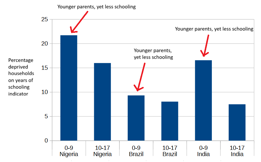
The likely answer is connected to the “non-negligible share of households classified as deprived“ phrase that I used earlier. The fewer than 20% of countries in the MPI that have a negligible share (< 1%) of deprived households on this indicator are countries that achieved near-universal primary education several decades ago6. Only four of them7 have a higher rate of years-of-schooling deprivation for children aged 10-17 than children in the 0-9 age range.
I’ll try to explain what I think is going on here. For simplicity, let’s assume all households consist of two parents and one child8. In a country which has had near-universal primary education for decades, the probability that both younger parents lack six years of schooling is very low - these would be very unusual parents - and also slightly lower than the probability for two older parents. Once we factor in whether the household’s child has completed six years of schooling, it’s difficult to predict which household, younger or older, will have a higher overall probability of years-of-schooling deprivation. We know that the probability of a younger child (0-9) not having completed six years is higher, close to 100%, because younger children are not old enough to have completed six years of schooling. Obviously, the probability of non-completion for an older child (10-17) is lower than that (most are old enough to have completed six years), but since these are very unusual parents the overall probability for the older household might still end up higher, or lower, than the overall probability for the younger household.
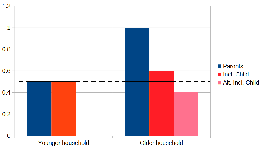
On the other hand, in a country which hasn’t had near-universal primary education for decades, the probabilities of years-of-schooling deprivation for younger and older parents are significantly higher, and parents who didn’t complete six years of schooling are not so unusual. These are the large majority of countries included in the MPI.
Let’s see how our very simplistic three-member households do in this scenario. Suppose younger adults (aged 30-39?) have a 20% probability of not having completed six years of schooling and older adults (40-49?) have a 30% probability of the same. There’s a 4% (0.2*0.2) probability that in a younger household both parents lack six years of schooling, while in an older household the same probability is 9%. After factoring in the probabilities of the younger (0-9) and older (10-17) children, the overall probability of the younger household remains close to 4%, but what’s the overall probability for the older household?
According to MPI data, most countries outside of Sub-Saharan Africa have rates of school attendance higher than 85% for children aged 10-17. The 10-17 child in the older household has roughly a 75% chance of having reached the age where, assuming she has attended school regularly9, she would have completed six years of schooling. So, this 10-17 child has very roughly a 36%10 probability of not having completed six years.
Applying this 36% probability to our previous 9% probability of years-of-schooling deprivation for older parents gives us an overall probability for the older household of 3.26%, lower than the 4% of the younger household. In the overwhelming majority of countries outside of Sub-Saharan Africa, school attendance rates are higher than 90%, and therefore the gap between higher years-of-schooling deprivation in younger households and lower deprivation in older households should be wider11.
I deliberately excluded Sub-Saharan Africa from the previous calculations, but let’s now apply the same logic to SSA, a region where fewer adults have completed six years of schooling.
Assume that the probability of both parents lacking six years of schooling is 20% for younger households and 30% for older household. If the probability that children aged 10-17 haven’t completed six years is 50%, then the overall probabilities of deprivation for the younger and older household end up being 20% and 15% (0.3*0.5) respectively. This means higher years-of-schooling deprivation in younger households. Even if we use a value of 40% or 60% for the children aged 10-17, younger households still show higher years-of-schooling deprivation (only with a value higher than 67% the reverse is true).
If the probabilities for parents are 20% (younger) and 40% (older), then a non-completion rate higher than 50% for 10-17 year olds would produce higher years-of-schooling deprivation in older households. But those rates would imply a very rapid increase in schooling going from the older parents generation to the younger parents generation, followed by a sudden stagnation or even reversal in the current 10-17 year olds generation. That seems very unlikely.
These are all back of the envelope calculations, but they lead me to think that higher years-of-schooling deprivation in children aged 0-9 than children aged 10-17 is likely just an artifact of the way OPHI chose to define and disaggregate this indicator (six years of schooling, 0-9/10-17 age cohort split). I could probably confirm (or refute) this if I had access to data broken down by shorter cohorts, but unfortunately this is not the case.
(If any of these calculations seem wrong to you, feel free to correct me in the comments).
Medians, distributions and standard deviations
Since I don’t have anything to comment on School Attendance deprivation (it just tends to be higher in the 10-17 age cohort than in the 0-9 one), I’ll move on to the last of the four health and education indicators: Nutrition.
As I’ve already mentioned, the MPI classifies a household as deprived in the Nutrition indicator if any member of the household under 70 years of age is undernourished. Notably, its definition of undernourished differs by age: for children under 5 years, a child is considered undernourished if their height-for-age or weight-for-age falls below two standard deviations from the median of the reference population.
Let me try to explain what height-for-age, weight-for-age and reference population mean. Height-for-age and weight-for-age are measurements used to assess the growth and health of a baby or toddler. Since babies can’t even stand up for themselves (they are cute though), they are measured lying flat on an infant measuring board. That’s why we talk of length-for-age instead of height-for-age for children younger than two years old.

By taking repeated height (and weight) measurements at different ages, you can plot a child’s growth curve, tracking their progress over time and allowing comparison of their height or weight against what should be normal at each age (say, normal height and weight at 18 months). Here you can see the length-for-age WHO plot for girls, from birth to 2 years, including not just the normal (median) growth curve, but also 2 and 3 standard deviation curves below and above the median.
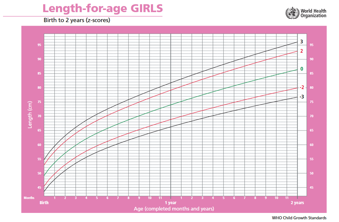
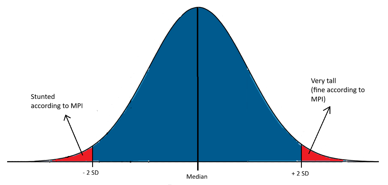
Once you have a large set of height and weight measurements for both boys and girls, you can construct normal distributions of both measurements at each age. The normal distributions of length (height) for girls are the ones used to create the pink plot above. At any given age, say 10 months, you could check the normal distribution and use it to classify a girl with a length above 76.5 centimeters as very tall, and a girl below 66.5 cms as stunted (or undernourished, in the case of weight). These thresholds, 66.5 and 76.5 centimeters in length, correspond to two standard deviations below and above the median of the 10-months normal distribution.
Where does the large set of height and weight measurements used to construct the normal distributions that the MPI uses as reference for children under 5 years come from? That question brings me back to the reference population I mentioned above. The MPI uses the normal distributions published in 2006 by the World Health Organization (WHO) as the Child growth standards.
From 1997 to 2003 the WHO conducted the Multicentre Growth Reference Study (MGRS), collecting primary growth data and related information from 8,440 healthy breastfed infants and young children in different countries: Brazil, Ghana, India, Norway, Oman and the U.S. In the WHO’s words12:
The growth standards developed based on these data and presented in this report provide a technically robust tool that represents the best description of physiological growth for children under five years of age. The standards depict normal early childhood growth under optimal environmental conditions and can be used to assess children everywhere, regardless of ethnicity, socioeconomic status and type of feeding.
The MGRS excluded children with illnesses that affect growth13 (approximately 2%), and included only children from high socioeconomic status families in the surveys conducted in the four low- and middle-income countries: Brazil, Ghana, India and Oman14.
This reference population was further selected for high compliance15:
leaving a sample of 1737 children (894 boys and 843 girls). Of these, the mothers of 882 children (428 boys and 454 girls) complied fully with the MGRS infant-feeding and no-smoking criteria and completed the follow-up period of 24 months (96% of compliant children completed the 24-month follow-up). The other 855 children contributed only birth measurements, as they either failed to comply with the study’s infant-feeding and no-smoking criteria or dropped out before 24 months.
This is the reference population.
Besides the under-5 definition of undernourishment, the MPI uses two other definitions: one for children aged 5-19 years, and another for adults in the 19+ to 70 years age range. The 5-19 year group definition is similar to the under-5 one but using age-specific Body Mass Index (BMI) normal distributions, and a threshold of two standard deviations below the mean. The adult definition classifies as undernourished any adult whose BMI falls below 18.5 kg/m2 (which is close to two standard deviations below the mean).
To summarize, the MPI classifies adults aged 19-70 as undernourished if their BMI falls below the the widely used underweight threshold of 18.5 kg/m2; classifies 5-19 children as undernourished by comparing their BMI to the normal distributions for their age and sex; and classifies children under 5 as undernourished by comparing their height (length) and weight to the normal distributions constructed from the reference population of the World Health Organization’s MGRS.
Well, that last part isn’t quite right. The normal distributions published by the WHO in its Child growth standards were not directly constructed from the raw measures taken during the MGRS. The raw distributions were first truncated16:
To avoid the influence of unhealthy weights for length/height, observations falling above +3 SD and below -3 SD of the sample median were excluded prior to constructing the standards. For the cross-sectional sample, the +2 SD cut-off (i.e. 97.7 percentile) was applied instead of +3 SD as the sample was exceedingly skewed to the right, indicating the need to identify and exclude high weights for height.
Between 0.7% (boys) and 0.4% (girls) of all observations were dropped in the longitudinal part of the study. I don’t know enough statistics to evaluate the effect of these exclusions on the final height and weight distributions, but I find it hard to believe they had no impact at all17.
Assumptions
Now that we have a clearer picture of where the WHO’s Child growth standards data comes from, let’s take a look at a few assumptions underlying the MPI’s use of this data to estimate child undernourishment, and consequently child poverty:
Children from high socioeconomic status families have the same genetic growth potential as children from lower socioeconomic status families18.
For a child of a given age, having a height, weight or BMI below two standard deviations from the mean of their age’s distribution is likely a consequence of experiencing poverty. There should be a positive relationship between higher likelihood of falling below two standard deviations from the mean and higher likelihood of experiencing poverty.
The height and weight distributions of the populations selected for the MGRS are representative of the distributions that would be seen in all countries of the world in the absence of health or environmental constraints to growth.
The first assumption can be tested by looking at Genome-Wide Association Studies (GWAS) and data from biobanks. Biobanks are large repositories of biological samples, including genomes, often encompassing data from hundreds of thousands of individuals, and they can be used to answer questions such as: do height and BMI have a causal role in socioeconomic status? Which is precisely what a study by Jessica Tyrrell et al. did in 2016, using data from the UK Biobank.
By disentangling the effect of genetic variants known to affect height from other factors, the study concluded that part of the reason higher-income populations are taller is a genetic predisposition to greater height19:
In the UK Biobank study, shorter stature and higher BMI were observationally associated with several measures of lower socioeconomic status… Genetic analysis provided evidence that these associations were partly causal. A genetically determined 1 SD (6.3 cm) taller stature caused a 0.06 (0.02 to 0.09) year older age of completing full time education (P=0.01), a 1.12 (1.07 to 1.18) times higher odds of working in a skilled profession (P=6×10⁻⁷), and a £1130 (£680 to £1580) higher annual household income (P=4×10⁻⁸).
Granted, this study was conducted in the UK, and you could argue that high-income populations in other countries differ from the British. But the MGRS itself argues against this by noting that there’s little difference in height between the selected high-income groups from Brazil, Ghana, India20 and Oman, and the reference groups from Norway and the United States21.
If the purpose of the Child growth standards is to have a benchmark against which we can compare the growth curve of every child in the world, it seems like a bad idea to construct that benchmark from a selected group that is taller and bigger than most populations.
If the justification for using a benchmark to assess undernourishment is that any child falling more than two standard deviations below the distribution’s mean is likely well below their genetic growth potential, it seems like a bad idea to use a benchmark constructed from a population with a substantially higher mean.
I suspect that the MPI wrongly classifies many children as undernourished by incorrectly assuming their height or weight is well below normal, when in reality their seemingly very low values reflect the use of the wrong benchmark.
There are a few facts we should carefully consider before judging the WHO’s MGRS benchmarks or the MPI Nutrition indicators too harshly. On the one hand, when the MGRS was published in 2006, biobanks were still in their infancy, and the WHO could argue there was no reason to think that children from higher-income families were genetically predisposed to be taller (though this is clearly no longer the case today). On the other hand, there was plenty of data at the time showing that higher-income populations were, and still are, taller on average even in countries with very low levels of poverty. In defense of the WHO, you could propose other causal mechanisms for shorter stature, distinct from poverty, but somehow correlated with levels of income. But then this last hypothesis wouldn’t excuse the use of short stature as a proxy for poverty by the MPI.
Richer and thinner
Regarding the second assumption, I haven’t seen any data that directly contradicts the presumed relationship between poverty and very low height or weight. But I can’t say the same thing about BMI, which the MPI uses to determine undernourishment in everyone aged 5 and older.
I took advantage of my familiarity with the Spanish National Institute of Statistics (INE) website to quickly check the data on children’s BMI, binned by occupational skill level of mother or father. This is a rough way of looking at children’s BMI by household income level, assuming the six skill categories roughly map to household income22. Here’s a chart showing the share of boys and girls aged 2 to 17 who are underweight, by household income level.
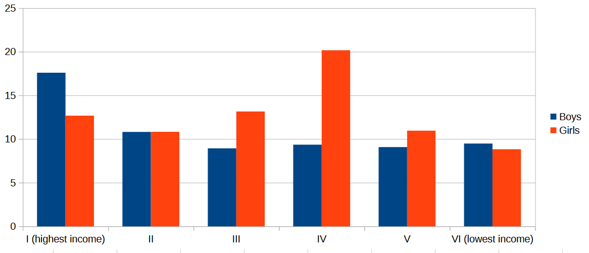
The highest percentage of underweight boys is found in the highest skill (highest income) category, while the highest percentage for girls occurs in the “Supervisors and workers in skilled technical occupations“ skill level (middle income?).
I might be mistaken (I’m open to see evidence to the contrary), but my impression is that the same pattern we see in Spain, of higher shares of underweight children in higher income households, is mirrored by most middle-income countries.
If that is the case, then it’s wrong to assume that a higher likelihood of child’s BMI falling below two standard deviations from the mean indicates a higher likelihood of experiencing poverty, at least in middle-income countries.
Rugby against poverty
Finally, regarding the third assumption, there’s plenty of data from rich countries, where health and environmental constraints to grow should be minimal, showing that average heights vary substantially. Norway, one of the countries selected for the MGRS, has an average male height of nearly 180 centimeters, while Japan, Singapore and Taiwan show averages between 170 and 172 cms.
If these large gaps in average height stem from differences in genetic growth potential between wealthy populations23, shouldn’t we expect to see similar differences among low- and middle-income countries also?
To explore this idea, I decided to chart Nutrition deprivation in the 0-9 age group against GDP per capita for all countries in Latin America, Europe, and the MPI-defined East Asia and the Pacific region24.
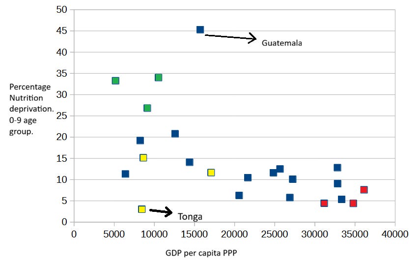
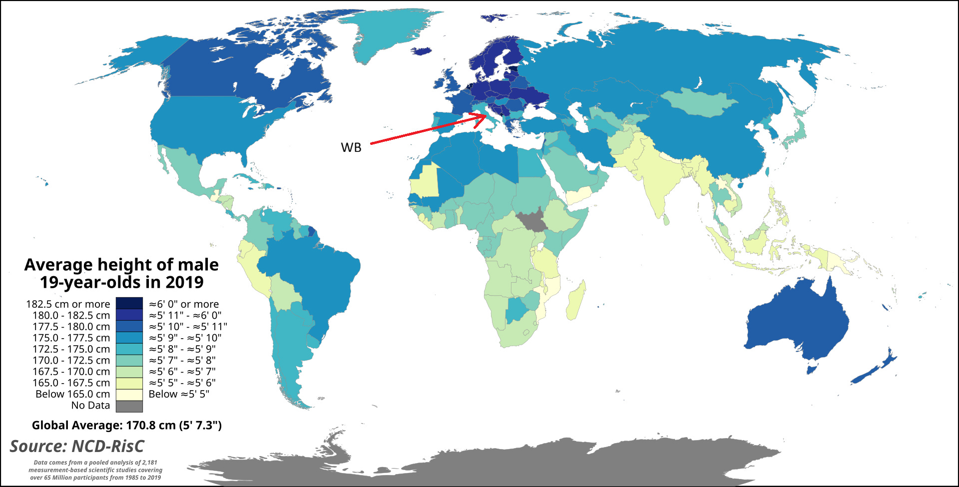
I’ve colored groups of countries that stand out due to their populations being exceptionally tall or short. The populations of South East Asia (green on the map) are noticeably shorter, just like the indigenous populations of the Americas. By contrast, the populations of the Western Balkans (red on the map) are exceptionally tall, as you can see in the following map of average male height by country.
Notice also that I marked Guatemala in the chart, the Latin American country with the highest indigenous ancestry in the sample, with an arrow. Guatemala has by far the highest reported rate of Nutrition deprivation among 0-9 year olds, even though its income level is near the average for this sample of countries.
Nevertheless, I believe the most striking country in the chart is Tonga. I colored the country yellow, together with other two rugby-friendly countries of Oceania: Fiji and Samoa. The three island nations are well known for their tall (and big) populations and their unsurprising fondness for Rugby, a sport in which they often hold their own against countries several times their population (not body) size. Tonga’s males, the tallest of the three populations, average a height of 177.9 centimeters.
It sure seems like taller countries have a lower rate of Nutrition deprivation than expected, and shorter countries have a higher rate of Nutrition deprivation than expected.
Notice that if height in middle-income countries25 is substantially determined by genetic factors, using BMI as a reference for undernourishment shouldn’t produce misclassification due to taller or shorter averages. BMI measures weight relative to actual height, and therefore shorter children are expected to weight less. But if children 0-9 are being misclassified as undernourished, this also affects the Nutrition indicators of 10-17 children and adults, since at least some individuals in those age groups live in the same households as children aged 0-9.
Putting it all together
To summarize: the Child mortality indicator is not just imperfect, but in regions of the world with high levels of violence, it’s likely a better index of exposure to violence than of poverty. I also suspect that the Years of schooling indicator is misleading as a measure of poverty for children in general, and younger children in particular, usually appearing to show a trend - higher child poverty among younger children - that is artificial.
Yet my biggest qualm is with the Nutrition indicator. I can’t think of any good reason to use the high-income populations of the six countries selected by the MGRS as a reference against which to measure the growth of every child on the planet. I can understand that in low-income countries, a share of population substantially higher than 2% falling below the mean for height, weight or BMI strongly suggests undernourishment in the population. In such cases, I think the MPI Nutrition indicator can provide meaningful information on child poverty, but I doubt that it does for middle-income countries.
I think it’s telling that, in middle-income countries with above-average height, the share of households with at least one presumed undernourished member seems to fall between 6% and 10%, which is roughly the percentage you would expect by random chance in households with three to five members.
Looking at middle-income countries that lack the Nutrition indicator is quite revealing: Vietnam and Indonesia, both lacking Nutrition data, show nearly the same overall MPI for the 0-9 and the 10-17 age groups. And Brazil has a lower overall MPI for children aged 0-9 than for those aged 10-17. If we examine the MPI Indicator contribution charts for these countries, and those of other comparable middle-income countries26, the large contribution of the Child mortality indicator to their overall MPI values stands out very clearly, particularly in urban areas.
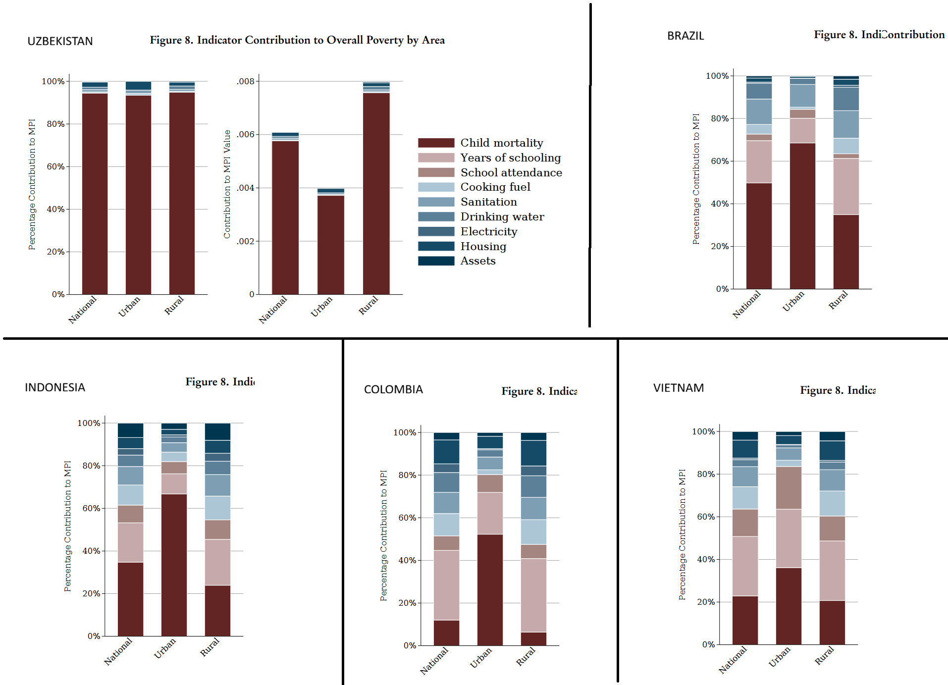
In the absence of Nutrition data, Uzbekistan’s MPI is almost completely explained by Child mortality. In urban areas, Brazilian and Indonesian MPI values are roughly two-thirds attributable to Child mortality, and urban Colombia’s MPI is around half Child mortality.
This suggests that for many middle-income countries, Child Mortality and Nutrition explain most of their MPI value in urban areas; and in some cases, in both rural and urban areas. This is worrisome, given what I’ve explained about these two indicators.
You can see this also in the case of Mexico: it has Nutrition data yet lacks Child mortality data, and its overall MPI is almost 80% explained by the Nutrition indicator. Besides Mexico’s chart, the following graph includes the MPI Indicator contribution charts for Argentina, Kazakhstan and China.
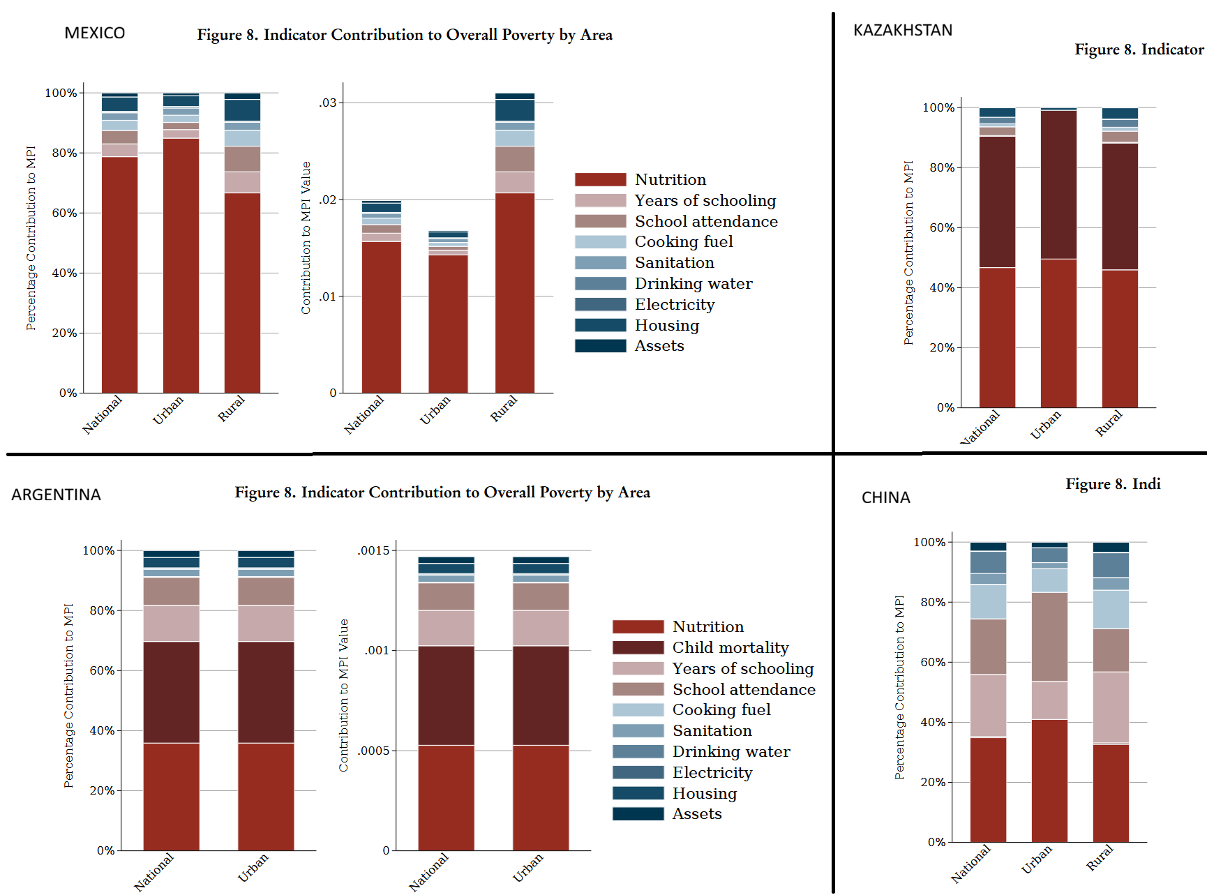
As you can see above, Kazakhstan’s overall MPI is almost completely explained by Child mortality and Nutrition, and Argentina’s is roughly 70% explained by those two indicators.
This post may sound as an overly harsh critique of the MPI and OPHI’s work. It’s not intended as such. I truly believe that the Oxford Poverty and Human Development Initiative does great work, and that its researchers make their best effort to measure international poverty, and child poverty in particular.
But I do believe that the MPI, and any similar index, should be scrutinized and analyzed in an effort to improve its validity and strengthen its use as a tool in international poverty comparisons and trend analyses. I hope the creators of the MPI and those who disseminate it (such as Our World in Data) take this post in that spirit.
I don’t think this represents a failing of the MPI itself. OPHI clearly states that poverty is evaluated at the household level. Though they do not emphasize that this means a household member may be counted as poor even if she doesn’t personally suffer from malnutrition or lacks schooling.
OPHI’s source is not one of the two international health surveys used in most countries (MICS and DHS). Its data for Ecuador comes from the Health and nutrition national survey (ENSANUT) which was conducted in 2018, before the recent spike in murders.
Only five countries in the MPI dataset do not show the 0-9 to 10-17 drop in child mortality rates, and only eight do not show the 10-17 to 18-59 drop.
Notice that two of the three countries that do show the expected drop from 0-9 to 10-17, Guatemala and Honduras, experienced substantially higher birth rates than Brazil and Costa Rica in the last few decades. During the 2010s, when the child mortality data was collected, Guatemalan and Honduran families were larger, increasing the likelihood of 10-17 children living in the same household with at least one 0-9 child.
The exact definition used to classify a household as deprived on the Years of schooling indicator is (from Appendices, Table A.1 of country briefings): “If all individuals in the household are in an age group where they should have formally completed 6 or more years of schooling, but none have this achievement, then the household is deprived. However, if any individuals aged 10 years and older reported 6 years or more of schooling, the household is not deprived.“
Most of them are former Soviet republics or small island nations.
These are Cuba, Kiribati, Kyrgyzstan and Samoa.
If a household has more than one child, and all of them belong to the same age cohort (either 0-9 or 10-17), this has little effect on my analysis. I’m assuming that households with children in both cohorts are a minority.
And assuming both probabilities are independent of each other.
1 - (0.75*0.85) =~ 36%.
Doing the same rough calculation as before, but with a 90% school attendance rate, gives us a 2.9% overall probability of years-of-schooling deprivation for the older household.
From the WHO Child Growth Standards, Methods and development, section 2.3: “A total of 1743 children were enrolled in the longitudinal sample, six of whom were excluded for morbidities affecting growth (4 cases of repeated episodes of diarrhoea, 1 case of repeated episodes of malaria, and 1 case of protein-energy malnutrition… Of these, 28 were excluded for medical conditions affecting growth (20 cases of protein-energy malnutrition, five cases of haemolytic anaemia G6PD deficiency, two cases of renal tubulo-interstitial disease, and one case of Crohn disease).”
From the WHO Child Growth Standards, Methods and development, section 2.1: “a population-based study that took place in the cities of Davis, California, USA; Muscat, Oman; Oslo, Norway; and Pelotas, Brazil; and in selected affluent neighbourhoods of Accra, Ghana and South Delhi, India….The study populations lived in socioeconomic conditions favourable to growth and where mobility was low, … Families’ low socioeconomic status was the most common reason for ineligibility in Brazil, Ghana, India and Oman, whereas parental refusal was the main reason for non-participation in Norway and USA.”
From the WHO Child Growth Standards, Methods and development. Intriguingly, Table 2 of the Methods and development document reveals that children of non-compliant mothers were on average 0.1 cms shorter and weighted 0.5% less than the children of compliant mothers.
From the WHO Child Growth Standards, Methods and development, section 2.4. The study consisted of two parts: a longitudinal part (0-24 months) and a cross-sectional part (18 to 71 months). The exclusion criteria differed between the two datasets. Both datasets were merged: “To fit a single model for the whole age range, 0.7 cm was therefore added to the cross-sectional height values before merging them with the longitudinal sample’s length data.“ Other observations were dropped (no explanation in the document), though they were few: “In addition, a few influential observations for indicators other than weight-for-height were excluded when constructing the individual standards: for weight-for-age boys, 4 (0.03%) and girls, 1 (0.01%) observations and, for length/height-for-age boys, 3 (0.02%) and girls, 2 (0.01%) observations. These observations were set to missing in the final data set and therefore did not contribute to the construction of the weight-for-length/height and body mass index-for-age standards”.
See Table 5 of the Methods and development document. Grok says that simply dropping all observations above +3 SD and below -3 SD of the median, without any kind of correction, would reduce the standard deviation magnitude by 15%-35%.
From the WHO Child Growth Standards, Methods and development, Executive Summary: “The MGRS is unique in that it was purposely designed to produce a standard by selecting healthy children living under conditions likely to favour the achievement of their full genetic growth potential.”
Jessica Jessica Tyrrell et al., Height, body mass index, and socioeconomic status: mendelian randomisation study in UK Biobank, BMJ 2016, doi: https://doi.org/10.1136/bmj.i582
There’s also a study by Marwaha et al. (2011), cited on Wikipedia, which confirms that Indian males from higher socioeconomic strata are, on average, at least 5 centimeters taller than males from lower socioeconomic strata.
From the WHO Child Growth Standards, Methods and development, Introduction: “By selecting privileged, healthy populations the study reduced the impact of environmental variation. Assessment of differences in linear growth among the child populations of the MGRS shows a striking similarity among the six sites, with only about 3% of variability in length being due to differences among sites compared to 70% due to differences among individuals (WHO Multicentre Growth Reference Study Group, 2006a).“
The six skill levels are: “I. Directors and managers of establishments with 10 or more employees and professionals traditionally associated with university degrees.
II. Directors and managers of establishments with fewer than 10 employees, professionals traditionally associated with university diplomas, and other technical support professionals. Athletes and artists.
III. Intermediate occupations and self-employed workers.
IV. Supervisors and workers in skilled technical occupations.
V. Skilled workers in the primary sector and other semi-skilled workers.
VI. Unskilled workers.”
They do, by the way. There’s plenty of evidence that height is mostly genetically determined and the frequency of genes affecting height varies between populations.
I excluded countries for which the MPI relied on surveys other than DHS or MICS as a source. Also excluded countries with GDP per capita PPP below $5,000.
By eyeballing the data in the chart, I would be tempted to place the threshold between low-income and middle-income countries somewhere in the $5,000-$10,000 GDP pc range.
I’ve excluded MENA countries from the graph.
Height is a largely genetic thing, even if nutrition also matters everything else equal. Serbo-Croats are among the highest people in Europe and were documented as such since Byzantine times, when chroniclers often mentioned that "Slavs" were very tall. This does not apply to Bulgarians, who are among the shortest of Europe.
Other populations like Dutch (now the tallest of Europe but in the late Middle Ages rather in the short end) or Galicians (now with younger generations among the tallest of Iberia but decades ago, in the 70s, the shortest ones instead). This has been attributed in both cases to improved nutrition... but, as I said above, it also largely depends on genetics: Japanese tried to improve their average height via nutrition and it didn't really work, Scandinavians and Horners are both among the tallest populations on Earth, yet they have very different economic and nutritional histories. Brits are quite privileged, yet they tend to shortish sizes, especially women, the same happens with French, Swiss and Finns (both genders).
Ref. old self-research on mine based on publicly available data (Europe only): https://forwhattheywereweare.blogspot.com/2012/08/the-height-of-europeans-and-myth-of.html