
UNICEF's Child poverty ranking ranks very poorly
Is it true that 1 in 3 children in Spain live at risk of poverty or social exclusion?

Is it true that 1 in 3 children in Spain live at risk of poverty or social exclusion?
I can’t remember where I first read about UNICEF’s Innocenti Report Card 18. It’s the kind of public report made by a well-known and respected international organization that is easily quotable by well-intended persons or organizations who want to spotlight serious but neglected problems in the world. The problem is child poverty in wealthy countries.
Instead of quoting the report directly, I’ll quote one of the well-meaning organizations that helped to disseminate it (in fact, I think it was their mention of the Canary Islands that first caught my attention, because, well, almost anything that mentions the Canary Islands grabs my attention).
According to recent data, about 1 in 3 children in Spain, or around 34%, live at risk of poverty or social exclusion. In late 2023, a UNICEF report named it the worst in the EU for child poverty, ranking it 36th out of 39 EU and OECD countries.
Save the Children has published similar findings - for example, that 1 in 3 Spanish children live in homes that cannot afford a summer holiday. Ironically, almost half of them live in the Canary Islands, one of Europe’s major tourist destinations1.
This casts Spain in a pretty negative light; the higher in the ranking, the higher level of child poverty. Although, if we take a look at the ranking table we’ll see that one of the three countries below Spain is Colombia (39th), which is unsurprising as it is the poorest country in the report2; another one is Turkey, also poorer though less so3; and the third one is the United Kingdom (37th), a fairly rich country… so there’s that. And despite all the talk about British decline, the UK is richer than Spain. So, why do these two wealthy countries have such high levels of child poverty?
Innocenti’s ranking methodology partly explains the UK’s position. Each country’s ranking is “based on [its] latest available rate of child income poverty and [its] success in reducing child income poverty”, allowing a country like Romania, with a higher rate of child poverty than Spain and the UK, to end up in a better position in the composite ranking - the UNICEF Innocenti rank - thanks to an impressive reduction in child poverty in the last few years4.
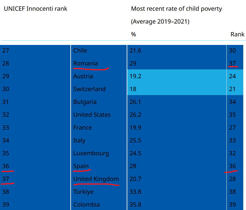
Notice that the ranking table above shows (surprisingly?) other rich countries, like the United States, France and Italy also near the bottom of the composite ranking. And before considering any recent changes in child poverty, Italy and the U.S. still rank very low on the child poverty index itself (33 and 35), nearly as low as Spain.
So maybe the United Kingdom’s 28th position in the child poverty index is not shocking (though 28 out of 39 still seems low), and its low rank in the composite ranking can be explained by a lack of progress in reducing child poverty in recent years. But I still think the positions of Italy, Spain and the U.S. are, if not shocking, at least surprising.
Given that all countries in the report are either high income or upper middle-income (EU or OECD members), perhaps small variations in the child poverty rate among countries that are on a similar (?) wealth level produce large variations in the ranking?But the child poverty rate varies widely between the reported countries: from a low of 9.9% in Denmark to a high of 28% in Spain5. This is clearly visible in a scatter plot of child poverty rate vs GDP per capita (PPP).
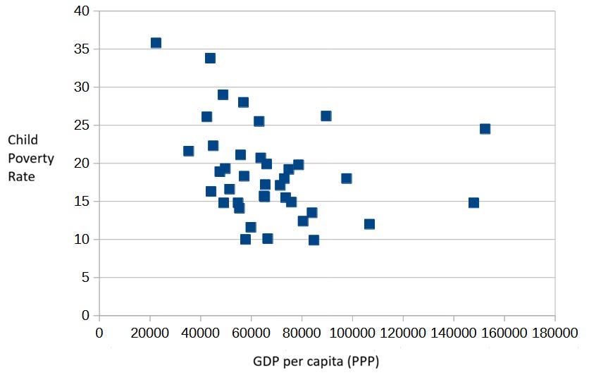
It’s hard to see any trend in that plot6. There is a weak correlation between child poverty and GDP per capita of approximately -0.30, but a very noisy one (R² = 0.08). As the report says: “there is only a weak tendency for richer countries to have lower child poverty rates“.
I wouldn’t just call it weak, but suspiciously, surprisingly weak. What’s going on?
A small clue to this puzzle is the fact that smaller countries dominate the top of the child poverty ranking: Denmark, Slovenia, Finland, Czech Republic, Norway, Iceland, etc. It’s as if a smaller population size has an effect in reducing child poverty. A regression model to predict child poverty from population size seems to confirm this intuition: the correlation coefficient is 0.33 (R² = 0.11), suggesting that population size explains slightly more of the variation in child poverty across countries than do variations in wealth.
What’s going on?
Well, after reading the whole report I realized the mystery was not so mysterious after all. The main source for the child poverty rankings is the Eurostat Database, maintained by the European Statistical Office (a department of the European Commission).
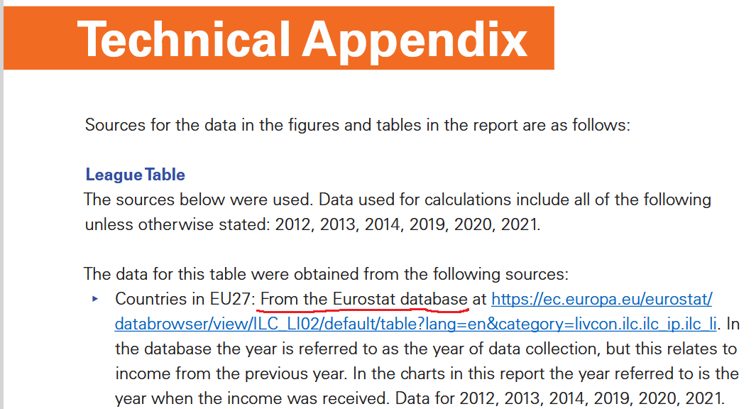
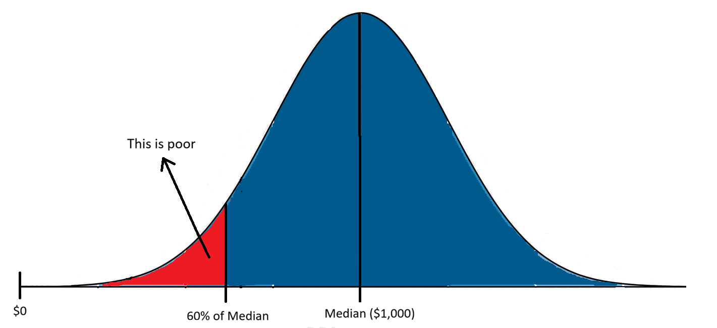
And the Eurostat index interpreted by UNICEF as child poverty is the at-risk-of-poverty rate from the Income and Living Conditions dataset7, which uses a threshold of 60% of median equivalized income after social transfers. Children living in households whose “per capita“8 income falls below 60% of the national median income (after social transfers) are classified as living in poverty9.
National just means that each country’s median income is calculated at the national level (more on that later), and equivalized means that all income sources (even social benefits) are added, while all taxes and social contributions are subtracted10.
So, what UNICEF is really saying when it ranks Spain 36th (or the U.S 35th) in child poverty among 39 high income or upper middle-income countries is that Spain has the 36th fourth largest share of households with equivalized income below 60% of the national median. This is a measure of inequality, not of poverty.
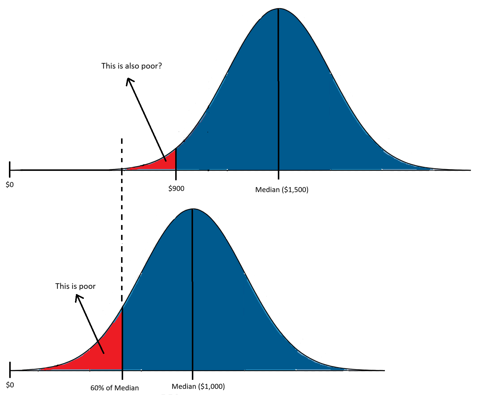
If median household income is $1,000, any child living in a household with an equivalized income below $600, regardless of actual material conditions, is considered poor.
To illustrate what “regardless of material conditions” implies, think of two countries: one with a median income of $1,000 and the other, relatively richer, with a median income of $1,500, yet both have identical income distributions. Depending on the income distribution (variance, skewness), most children classified as “poor” in the richer country could enjoy better material living conditions than any of the children in the (relatively) poorer country.
If we understand poverty as the lack of essential economic resources, then UNICEF’s Innocenti Report Card child poverty ranking does not measure poverty. And this is not just my opinion but also what Eurostat (the data source used by UNICEF) says:
The at-risk-of-poverty rate is the share of people with an equivalised disposable income (after social transfer) below the at-risk-of-poverty threshold, which is set at 60 % of the national median equivalised disposable income after social transfers. This indicator does not measure wealth or poverty, but low income in comparison to other residents in that country, which does not necessarily imply a low standard of living.
Why does UNICEF present an inequality index as if it were a measure of child poverty? I truly don’t know.
You might argue that, given the same level of wealth, a more unequal country should have more poverty than a less unequal one. And you would be right. I know this because Eurostat also collects data on severe material and social deprivation in European countries, and the correlation between percentage of children (under 18 years) experiencing severe deprivation and the share of children in households below the 60% threshold is 0.65 (R² = 0.43), a correlation that strongly suggests more unequal countries tend to have higher levels of child poverty when measured by actual material conditions.
On the other hand, if there is reliable data on child poverty measured by actual material conditions, why doesn’t UNICEF publicize it?
To clarify how Eurostat measures material and social deprivation, here are the 13 items it assesses for their presence or absence in households:
capacity to face unexpected expenses.
capacity to afford paying for one week annual holiday away from home.
capacity to being confronted with payment arrears (on mortgage or rental payments, utility bills, hire purchase installments or other loan payments).
capacity to afford a meal with meat, chicken, fish or vegetarian equivalent every second day.
ability to keep home adequately.
have access to a car/van for personal use.
replacing worn-out furniture.
having internet connection (individual level).
replacing worn-out clothes by some new ones (individual level).
having 2 pairs of properly fitting shoes (including a pair of all-weather shoes, individual level).
spending a small amount of money each week on him/herself (individual level).
having regular leisure activities (individual level).
getting together with friends/family for a drink/meal at least once a month (individual level).
The percentage of children in poverty is defined by Eurostat as the proportion of underage population lacking at least 7 out of the above 13 items. On this index, which actually measures material poverty, Spain ranks 13th and Italy 17th in child poverty among 34 European countries. Not great, but hardly headline grabbing.
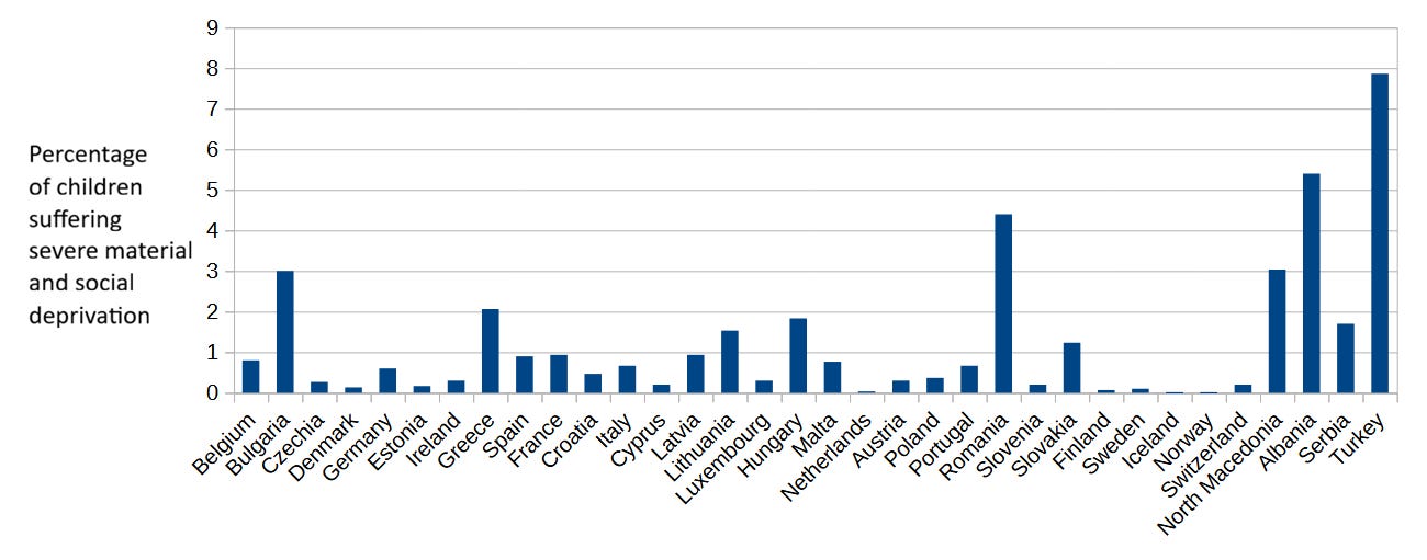
More importantly, this measure of child poverty shows that fewer than 1 in a hundred Spanish (or Italian) children live under conditions of severe material and social deprivation. Child poverty is uncommon in rich countries.
Very uncommon.
But that’s not the whole story. Remember I said smaller countries appear to experience lower child poverty under the flawed 60% income at-risk-of-poverty index? That was just a product of lower economic inequality in smaller countries, which tend to have more homogeneous populations.
Now, let’s think of large countries as composed of smaller countries. An homogeneous large country is composed of several similar regions, with similar populations, similar average incomes and income distributions. Its 60% of national median income doesn’t differ much from the 60% of median income in each of its regions. On the other hand, a large heterogeneous country is comprised of multiple regions with not-so-similar populations, with differing average incomes and income distributions.
And which European countries are large (by European standards) and heterogeneous? That’s right: Spain and Italy.
Back to Spanish regional differences (yes, again)
This brings us back to the Canary Islands - and also to Southern Italy. Does the actual child poverty index show the same huge differences in poverty between Spanish and Italian regions as the flawed index did?
in Italy, there are long-standing disparities in wealth between the north, the centre and the south. This means that, in 2021, the highest regional child poverty rate in Campania in the south (39 per cent11) was four times as high as the lowest rate in Trentino-Alto Adige in the north (9 per cent12).
Although Eurostat doesn’t provide data on severe material deprivation among children broken down by European regions, it does provide such data for the overall population. And the correlation between severe material and social deprivation in children and the overall population is higher than 0.8, so we can use the general population percentage as a good approximation for the underage percentage.
Here are the percentages of the population suffering severe material and social deprivation in each Spanish and Italian region:
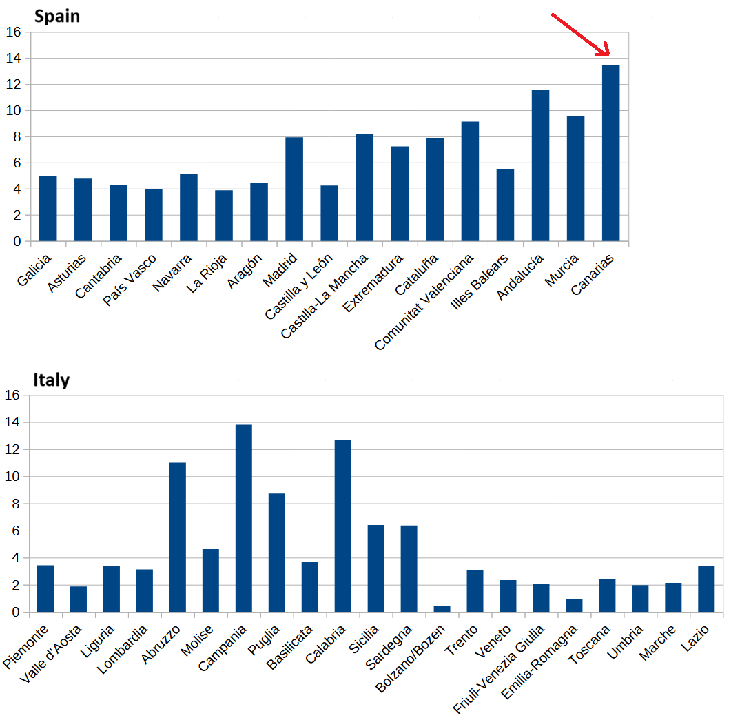
So yes, when using a proper poverty index, the Canary Islands exhibit the highest level of overall poverty in Spain - around three times higher than the lowest regions - and therefore likely the highest child poverty rate.
The gap between poor regions and rich regions is even wider in Italy: ignoring Bolzano’s exceptionally low rate, Campania and Calabria have poverty rates more than 10x those of Italy’s richest regions. One would expect to see these kinds of poverty gaps between countries rather than between regions of the same country.
Spain and Italy are very unusual European countries indeed.
Quotes from Spain’s Persistent Poverty Problem, by Mark Nayler, in the Foundation for Economic Education site.
In fact, many Latin American migrants to Spain come from Colombia.
Remember these are all OECD or EU countries. Turkey’s GDP per capita (PPP) seems to be only 22%-23% lower than Spain’s.
Romania ranks eighth in Change in child poverty rate (2012–2014 to 2019–2021).
Not considering Romania (29%), Turkey (33.8%) and Colombia (35.8%).
The report includes a scatter plot of GNI per capita vs child poverty rate, which looks similar to this one.
A few pages after declaring “In a time of general prosperity, more than 69 million children live in poverty in some of the world’s richest countries“ in the opening paragraph of its executive summary, the report mentions monetary and non-monetary measures of poverty and then proceeds to declare that “[non-monetary] poverty is rare in wealthy countries“ and therefore (?) the at-risk-of-poverty rate should be used.
I use “per capita“ to reflect that household income is divided by the number of “equivalent adults“ in the household, giving a weight to every member of the household: 1.0 to the first adult; 0.5 to the second and each subsequent person aged 14 and over; 0.3 to each child aged under 14. Neither the report nor Eurostat use the term “per capita” to explain this.
Notice that I’ve omitted the word “risk” because UNICEF’ own report dropped it, even though it is used by Eurostat (their source): “Other organizations sometimes use different terms. For example, the EU refers to it as ‘at risk of poverty’.“
See the definition of Equivalised disposable income.
Bullshit.
Bullshit.
Very nice research and analysis, Javiero!
I did not know how UNICEF was defining childhood poverty, but now that I do know I agree it is very misleading and seems statistically illiterate. It reminds me of an administrator I once worked with who wanted employees to be disciplined whose performance scores were below the median score, since having such a score meant that they were worse than the average employee. But of course 50% of employees will be in the lowest 50%--that's what 'median' means*. (*While not to be confused with "what 'means' means," or "what 'having means' means," as the UNICEF authors also seem to have done.)
Relatedly, some countries are going to score worse than other countries on a ranking of childhood poverty--no matter how accurately childhood poverty is measured--because that's what a ranking is. But that doesn't mean that the worse-scoring countries are necessarily doing a bad job--especially when we are already looking at relatively well-off countries. We'd do well to reflect on the massive progress that's shown by poverty markers including "not going on holiday once a year" and "not having a car for personal use" rather than "having a BMI <17" or "not having access to potable water" or "not being vaccinated against any disease."
Finally, so much respect for your defense of the Canary Islands from doom-mongering analysts with moving goalposts. I feel like you and I are on opposite sides of the Atlantic, on different islands, but still fighting the same fight of using statistics correctly to stand up for the distinct values of our homes.