
Why Argentina is not rich. A tale of two countries
An economic growth disaster in the Southern hemisphere

Argentina is in the news again with the recent inauguration of Javier Milei as its new president, and as usual - at least when the news from Argentina revolves around politics or the economy, rather than sports - we find ourselves once more discussing Argentina as the epitome of an economic growth disaster, a cautionary tale on the harms of policy X or the risks of policy Y.
In fact, you might read something like the following:
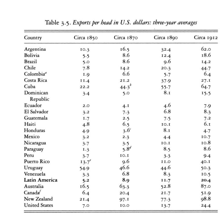
This country had the third highest GDP per capita in the world in the year 18951 while now it’s down to 32nd place in the world2. It was an export powerhouse with $77.3 of exports per capita in the year 1890 ($98.8 in 1912), one of the highest level of exports per capita in the world at the time3 while now it has plummeted to 36th place4 in exports per capita, causing widespread child poverty5 and the emigration of 24.2% of its most skilled workers6.
Except, the country I just described is not Argentina.
The country I just described is New Zealand.
And it might be a good idea to take a look at New Zealand in order to better understand what happened to Argentina’s economy in the last century. Maybe some common causes for Argentina’s and New Zealand’s decline can be found, and maybe that would help us to understand what can and cannot be done in the case of Argentina.
The same historical GDP figures which tell us that Argentina has been an utterly and complete economic failure in the last century tell us that New Zealand has also been an economic failure in the last century. These figures, the ones I’ll use throughout this post, come from the Maddison Project Database (2020 version) of the Groningen Growth and Development Centre in the University of Groningen, who continue the work of the late economic historian Angus Maddison.
The position of Argentina in the list of richest countries in the world during that golden age of the 1890s was eighth, while now it’s barely number 57. Here are the ten richest countries from that 1890s list with their per capita income in dollars.
United States: $7,146.33
United Kingdom: $7,037.33
New Zealand: $6,111.11
Australia: $6,102.78
Switzerland: $5,721.11
Belgium: $5,610.78
Netherlands: $5,254.44
Argentina: $4,779.11
Denmark: $4,380.00
Austria: $4,263.33
In order to have a good sense for how Argentina and New Zealand have done in the last 120 years compared to their 1890s peers I’ll use the average GDP per capita of the other six highest countries in that list (1st to 7th, excepting 3rd of course), and I’ll call those six countries the rich six. They are my control group.
The following chart shows the ratio of both Argentina’s and New Zealand’s GDP per capita compared to the rich six average GDP per capita for each 5-year period starting with 1896-1900 and ending with 2016-18 (there’s no data for 2019-20). NZ starts with a ratio of 1.0 for 1896-1900 while Argentina starts with a ratio of 0.78.

We can already discern a few things just by looking at that chart.
Argentina is already a fair bit poorer than the rich six in the 1890s albeit very rich by world standards. This disparity is related to the significant variation in GDP per capita values during that period.
Up until 1946-1950 (ratio of 0.75) Argentina does not show much decline compared with the rich six. The dip during 1936-45 can be partially attributed to the Second World War.
New Zealand stays close to the rich six until 1961-65 with its decline being particularly pronounced during the 1960s, the 70s and 80s.
Argentina’s decline takes place mostly during the four decades spanning from the 1950s to the 80s.
The last two or three decades have been a very stable period for the incomes of Argentines and New Zealanders compared with the rich six, excepting the 2001 Argentinian crisis of course. New Zealand has stabilized around a ratio of 0.7 and Argentina around a ratio of 0.4.
One might also be tempted to conclude that since Argentina has gone from a ratio of 0.77 to 0.40, a 0.37 decline, and NZ has gone from 1.0 to 0.7, a 0.30 decline, their decreases in income are very similar. But equal declines in the ratio do not represent equally disastrous decreases in income. Think of a hypothetical country A that goes from a ratio of 0.11 to 0.01, a 0.1 decrease, and a country B that goes from 1.0 to 0.9, a similar 0.1 decrease. Country A would probably be in shambles while country B would just be a little less rich.
That being said, I don’t think anyone can say that the New Zealand of today is just a little less rich than the New Zealand of 1895. Unless it’s in the sense that everyone living in a middle income country today has a better standard of living than a medieval king, which is irrelevant to this discussion.
That caveat aside, the chart suggests that New Zealand's economic decline is comparable to Argentina's. I now intend to look at the possible causes of both declines and also attempt to explain why New Zealand has nevertheless done markedly better than Argentina.
As I mentioned previously, NZ had likely the highest level of exports per capita among farming exporting countries in the world during the 1890s, with Argentina not far behind at number six in 1890 and number four in 1912. They both exported wool, meat, dairy and wheat, the usual staples of farming exporting countries from temperate climates (see Australia, Uruguay).
The problem with being an economy dependent on farming exports is that the source of wealth, massive amounts of available cropland and pasture, is finite. And even though massive on per capita terms at the start, as time passes and the country’s population grows cropland and pasture per capita will diminish more and more.
This is related to the attribute of oil-exporting countries where a country with large oil exports and X population (think Algeria) is almost always much richer in per capita terms than a country with 10X population and the same level of oil exports (think Nigeria).
For the objects of our interest, Argentina and New Zealand, their populations have grown more than eleven times since the 1890s in the case of the former and almost eight times in the case of the latter.
This already sheds some light on why Argentina’s decline has been even more pronounced that New Zealand’s, since starting from the time when both were very land-rich Argentina’s population has grown a bit more.
Let’s take a look at both countries’ cropland and pasture hectares7 per capita from the year 1890 to 2010.

That chart makes it clear that per capita cropland and pastures have consistently gone down from the 1950s on in the case of NZ and from the 1960s on in the case of Argentina. Assuming the prices were stable in the long term during more than a century, the income per capita that both countries could get from their land wealth was bound to decrease.
Yet prices for their farming products were not stable during that period of time, in fact they decreased for the most part. That is the case for wool:

And for milk:

And for wheat:

Which means that Argentina and NZ were getting less and less money for each unit of exported farming products. Both seem to have milked their land wealth until there was not much left, the only difference being that Argentina milked its wealth dry (well, almost) much faster due to its population growing faster. This is also visible in a chart of the per capita exports (not just farming products but all exports) of Argentina compared to New Zealand8

The chart shows clearly that even in the 1890 to 1930 period Argentina only exported 30% to 60% in per capita terms of what NZ exported.
We can also notice a few other things in that chart:
The post-World War II peak, immediately followed by a fall in exports almost as big as the fall of the Great Depression.
The relative slow decline, compared to NZ (this is a ratio), during the 1960s, 1970s and 80s going from around 15% of the value for New Zealand to around 10%.
The end of that slow decline around 1993, with exports increasing during the last three decades up to around 20% of the value for New Zealand. This coincides with the period of stability in Argentinian incomes, compared to the rich six, that I mentioned above.
This last point is particularly interesting because it seems to imply that for the last few decades the relative economic decline of Argentina, save for the 2011 crisis and the current one, has stopped.
The usual suspect
One of the most commonly mentioned causes for the economic decline of Argentina, at least out of the ones I’ve heard in casual conversation and read in some academic analyses, is the signing of the Roca-Runciman Treaty between Argentina and the United Kingdom in May 1933.
The story goes that driven by the economic hardship of the Great Depression and the large drop in Argentinian exports, of which the UK was taking up to 28% before 1929, the Argentinian government at the time decided that the only way out was to negotiate a series of concessions to British businesses in Argentina (meat-packing, railroads, etc…) in exchange for a guaranteed minimum level of beef exports. Was the Roca-Runciman treaty the best deal for Argentina, or at least a good enough deal, or was it an unequal treaty with very negative long-term consequences for the Argentinian economy? The denouncers of Roca-Runciman of course believe the latter.
Did Roca-Runciman allow Argentina to go back to its pre-Depression level of exports to the UK, or at least prevent a further decline?
The answer to the first question is no. Exports to the UK did not go back to their pre-Depression levels, but considering that the 390,000 metric tonnes of refrigerated beef stipulated in the Roca-Runciman treaty were equivalent to the 1932 beef exports from Argentina to the UK, we can assume that beef exports at least remained on the 1932 level.
As relates to total exports, Roca-Runciman doesn’t seem to have affected them. In fact Argentina did better in the years after Roca-Runciman compared to NZ.

This makes me very skeptic of the usual narrative blaming Roca-Runciman, at least to a large degree, for Argentina’s decline.
I intend to explore a few other usually mentioned causes of Argentina’s decline in a follow-up post to this one, but for now I want to wrap-up this essay by going back to the major cause, not of the decline of Argentina and New Zealand, but of their previous wealth.
The secret sauce
A few other countries did have as much cropland and pasture per head as New Zealand and Argentina did at the turn of the twentieth century. Some of them were just as wealthy, such as Australia and Canada, but others weren’t: Mongolia, Botswana, Bolivia, etc…. Hence there was more to their prosperity than just having lots of agricultural and grazing land, and that other factor which made possible such prosperity, according to most accounts and also according to my opinion, was massive skilled immigration.
This begs the question: what were the immigration policy and levels of immigration of New Zealand and Argentina once decline set in.
Both countries cut down on immigration during the Great Depression, with Argentina requiring a labor contract prior to arrival (or proof of means of support) starting in 1932, and New Zealand dropping government assistance for immigration in 1931 and shutting down its Department of Immigration in 1932.
After the Second World War, when both countries had the opportunity to welcome some of the millions of displaced persons stuck in refugee camps in Europe, New Zealand took 5,000 refugees in while Argentina only took around 30,000, almost half in per capita terms9.
From 1950 to 1990 neither country received many immigrants compared to the previous massive waves10, but the most dramatic change was the shift in the sources of those immigrants.
For Argentina this shift meant most new immigrants came from neighboring Latin American countries attracted by the comparatively higher wages, and for NZ it meant most new immigrants now came from Asia and the Pacific Islands.
To put it in terms of skilled vs unskilled immigration, Argentina shifted to a pattern of low unskilled immigration while New Zealand shifted to a pattern of higher skilled and unskilled (roughly half and half) immigration.
Fast forward to 2023 and more than 10% of New Zealand’s population is comprised of highly skilled Asians, while Argentina has not taken any measures to attract new highly skilled immigrants in the last few decades in order to re-create the labor pool that made it such a rich country a century ago.
Both countries still have large amounts of cropland and pasture per capita (among the world’s 10 highest for cropland) but in the modern world it’s difficult to be a rich country just by exploiting land wealth11, and having a highly skilled population is a requirement for any country trying to become (again) rich, or at least to close the income gap with rich countries.
I wish Milei all the luck in the world. He’ll need it to close the gap with New Zealand, and the better he does in the next four years the better Argentinians will do, but I don’t see any way for Argentina to become again the rich country that it once was. Not in the foreseeable future.
In case you wonder about cherry picking, that rank holds for the average GDP per capita for the years 1891 to 1900.
2010 to 2018 average.
Likely the highest for farming exporting countries. Victor Bulmer-Thomas. “The economic history of Latin America since independence“, p. 68. United Nations Statistics Division: https://unstats.un.org/unsd/trade/imts/Historical%20data%201900-1960.pdf
Source: https://en.wikipedia.org/wiki/List_of_countries_by_exports_per_capita
Source: http://www.stuff.co.nz/dominion-post/news/9492016/One-in-four-Kiwi-children-living-in-poverty
Source: https://www.nzherald.co.nz/nz/quarter-of-nzs-brightest-are-gone/JU2KSG7ZWDUMTF4UBVM7H52P5Y/
An hectare is equivalent to 2.47 acres.
Several sources. Wikipedia, https://en.wikipedia.org/wiki/List_of_countries_by_exports_per_capita. UNSD, https://unstats.un.org/unsd/trade/imts/Historical%20data%201900-1960.pdf. Victor Bulmer-Thomas, “The economic history of Latin America since independence“. CEPAL, https://repositorio.cepal.org/server/api/core/bitstreams/eb50eea3-e4c1-4b83-a14a-bc32673ec16c/content. Macrotrends, https://www.macrotrends.net/countries/NZL/new-zealand/exports.
Source: https://cdn.un.org/unyearbook/yun/chapter_pdf/1950YUN/1950_P2_SEC10.pdf
For NZ a very rough estimate is 200,000 to 300,000 immigrants, and for Argentina around one million immigrants.
Unless the country in question also has large mineral or energy wealth, as Saudi Arabia, Qatar and other Gulf countries have clearly shown.
Great piece. I wonder what the impact of non-renewable resource extraction was on this dynamic. Argentina was famously rich from silver exports, but I believe that dried up before the start of your analysis. Timber extraction from old growth forests could also be significant. The decline in the world market for wool was also significant. Australia pivoted from wool, gold and timber in the early days to coal/iron ore/etc over time but neither NZ or Argentina had the resources or proximity to buyers like China to make that work. Do you also think NZ and Argentina are both in the same figurative and literal boat in being so distant from potential export markets? The recent rise in shipping prices has to be hitting them harder than other competitors.
Javiero, why do people think the Roca-Runciman treaty triggered Argentina’s decline?
I recall being told that New Zealand’s decline was due to the UK joining the EEC in 1973, which cut off NZ’s largest export market. But based on your data it looks like NZ’s decline pre-dated this event.