

I have an unusual habit for someone who doesn’t watch much TV. I like to watch, or sometimes read, movie reviews or TV show reviews, especially when they are of the long format meticulous kind. And during a certain period of time, a few years ago, I did spend a lot of time watching many youtube reviews and many movie and TV critics’ videos.
I noticed some of these youtubers mentioned some very well known ratings and reviews aggregator sites, especially Rotten Tomatoes (RT for short), when discussing the popular reception of a movie or TV show, and sometimes not just to provide context for their video review but actually casting doubt on the veracity of the ratings scores provided by Rotten Tomatoes.
This puzzled me a bit. Being a popular youtuber doesn’t necessarily make you the most objective TV critic, and yet the numbers guy in me felt a bit uncomfortable about their questioning of a score mechanism, and yes I call it a mechanism, which at first sight seems so simple and transparent. Simple and transparent should mean trustworthy.
The Rotten Tomatoes’ scores that worried me are audience scores, not critics’ scores since I don’t consider myself to be qualified to question a group of critics’ objective opinions about a TV show, but I do consider myself to be competent enough to look for whatever data is publicly available for some TV shows and check whether Rotten Tomatoes’ audience scores for those shows make sense.

And the public data that is available are audience reviews left by users of Rotten Tomatoes for movies and TV shows, not all ratings left by users of RT. So I started digging into the audience reviews data for a sample of TV shows, trying to figure out a way to corroborate RT’s audience scores, and I focused on TV shows instead of movies because they are easier to check for technical reasons.
If you don’t care much about my criteria for choosing the sample of TV shows and already know how RT calculates audience scores for TV shows, then skip the next two sections and go straight to Calculating my own audience score ratings.
The sample
The sample I chose consists of 343 TV shows. Some of those shows are actually different seasons of the same show, such as Cobra Kai. Cobra Kai season 2 came out in 2019, s03 in 2021, s04 in 2021, and s05 in 2022, so those 4 seasons count as 4 shows and each of them has its own audience score in RT and its own reviews. From now on when I talk of a TV show I’m actually talking of a certain show for a certain season.
If you are wondering why I didn’t mention Cobra Kai s01, it’s because I limited the year in which shows were broadcast to a range from 2019 to 2023. Before 2019 there were fewer shows made by Disney and Apple (Apple TV+ didn’t exist) and that made those years less interesting than the last 5 years.
I’ve uploaded the list of shows to GitHub in case you want to take look at the whole list, and if you do you might realize there are not many small little known shows in that list. That is because another consideration in choosing my sample of shows was to include only shows with at least 50 public reviews, in order to avoid shows where just a few reviews could bias the analysis. That means a show like Wellmania with only 16 public reviews as of today doesn’t get included, despite the fact that RT says it has 50+ ratings because RT counts even ratings without a corresponding public review.
I restricted the sample to TV shows in the most popular genres, trying to include all shows in those genres in order to avoid cherry picking while at the same time limiting the genres so the sample didn’t grow too big. That means not including any sports dramas, no “unscripted” shows, no “reality” shows, no docuseries, no shows in languages other than English, no anime, and most important of all… NO musicals.
Finally, I restricted the sample to shows produced and broadcast by these studios or streaming services: ABC, Amazon, Apple, CW, Disney, HBO, Hulu, Netflix, Paramount, Peacock/NBCUniversal. These are not just the biggest producers of TV shows for the American market but most of the World.

All data for the shows in this sample I obtained during the third and fourth weeks of June 2023. And a note on naming of the shows. Throughout this article I’ll use the normalized Rotten Tomatoes names for shows, meaning I’ll prefer the_lord_of_the_rings_the_rings_of_power to The Lord of the Rings: The Rings of Power.
Next, I’ll explain a few things about RT’s ratings and reviews. If you are already familiar with those and know how RT calculates audience scores for TV shows, then skip the next section and go straight to Calculating my own audience score ratings.
How does RT calculate the audience score for a TV show?
RT takes all the ratings from all the users who rated that show and calculates the percentage of users that rated the show 3.5 stars (on a scale of 0.5 to 5 stars) or higher.

So, for these made up ratings for an unnamed show:

We’ve got 4 ratings: 2 stars, 5 stars, 3.5 stars and 3 stars, and so the audience score would be 50% because two out of four ratings are 3.5 stars or higher. And there’s definitely something wrong with the captain’s hair.
In that example all four ratings were left by users who also left a review, but in real life a lot of users just leave a rating for a TV show without writing a review, and those ratings without a review are also considered by RT when calculating the audience score.
From now on, when I talk about review ratings I mean ratings that are public because they have a corresponding review.
Calculating my own audience score ratings
Rotten Tomatoes does something very sensible when you browse through all the reviews for a TV show. It shows you reviews with their corresponding 0.5 to 5 star rating but doesn’t show you ratings without a review, even though all ratings are considered when calculating the audience score. Since my goal was to check whether there was something fishy with audience scores for some TV shows, I thought that a good way to do that was to calculate the audience score not from all the ratings for a show - which RT doesn’t publish - but from those ratings that are public because they have a review.
Of course estimating the audience score from the ratings of (public) reviews is not perfect. I can only estimate what fraction of all user ratings are review ratings for a show, because RT does not show the exact total of all ratings for a show, but a rough estimate says it’s usually between 15% and 50%. That should be a good sampling of all the ratings assuming nothing biases that sample, such as users who leave a review being more likely to rate a show lower than all users who rated that show or more likely to rate a show higher. In general, any change in the distribution of ratings between review ratings and all ratings will produce a difference between RT’s audience score and my estimated audience score.
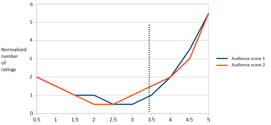
What do I mean by distribution of ratings ? This.

As you can see from the graph most shows are hated by a lot of people, loved by a lot of people, or both.
If the distribution of ratings for my sample (review ratings) is different from the real distribution of ratings, the one only RT knows, then almost certainly my estimated audience score will be different from RT’s audience score. How much different?
Here is a (made up) case were the difference is zero:
And here is a case where the difference is 8 percentage points (73% vs 65%):

And here is a case where the difference is 14 percentage points (83% vs 69%):

The larger the difference in audience scores the more dissimilar the ratings distribution curves, real and estimated, will need to be.
How different are the audience scores that I estimated from RT’s audience scores?
This is the distribution of differences (AS differences) for all the TV shows and seasons that I used as my sample, with each bar representing how many shows have that much of a difference, positive or negative. Technically, it’s a histogram. For instance, the zero difference bar (in light blue) has a value of 13 indicating that 13 TV shows have zero difference between the audience score that I estimated from public review ratings and the audience score that RT gives for those shows.
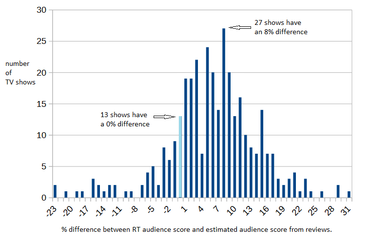
Assuming there is no bias in the review ratings compared to all ratings the previous graph should show something close to a normal distribution centered on the bar for zero difference. But it doesn’t.
It shows that most estimated audience scores are lower than RT’s audience scores. That is what positive values for difference indicate, while negative values for difference indicate estimated AS that are higher than RT’s AS.
The average (mean or μ) for that distribution is a 5.99 percentage points difference, so for the “average” show my estimated audience score is 6 percentage points lower than RT’s audience score (e.g: 80% vs 74%).
That seems unusual if there is no bias in the review ratings.
I’m not implying that every show with a positive difference in that graph has a suspicious audience score in RT. I’m also not implying that all shows with a positive difference greater than the mean (greater then 6) have a suspicious audience score in RT. But that distribution taken as a whole does look a bit fishy, so I decided to keep digging.
Given the mean and standard deviation for this distribution, I would expect around 15.9% of all TV shows to have an estimated AS difference bellow -2.66 and around 15.9% of all TV shows to have an estimated AS difference above 14.64.
This is a good way to visualize why:

Actually, 50 shows out of the total of 343 have a difference of 15 or more and 39 shows have a difference of -3 or less, as shown here:
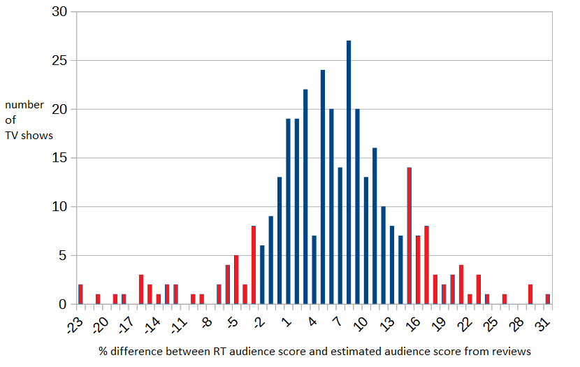
Now let’s take a closer look at those shows in the upper tail and the lower tail of the distribution of AS differences, the ones in the red bars of the previous graph.
As I’ve mentioned before, I decided on a cut-off value of at least 50 review ratings in order to avoid shows where just a few reviews could skew the analysis. Maybe most of those shows in the upper and lower tails of the distribution are close to the 50 review ratings threshold and that explains why they have such a large AS difference ?
When it comes to the lower tail, the shows for which I estimate a higher audience score than RT, that seems to be the case, with an average of 225 review ratings per show and a third of shows having 75 review ratings or less.
But for the upper tail the picture is not so clear. The average is 419 review ratings per show, and only 18% of those shows have 75 review ratings or less.
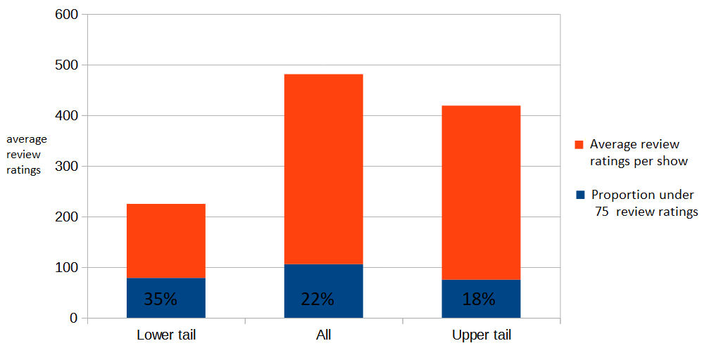
So shows in the lower tail are smaller. Smaller than all shows - the average number of review ratings for all shows is 481 - and much smaller than shows in the upper tail. And that was to be expected. What is unexpected is that shows in the upper tail are somewhat big.
Upper tail, lower tail and review ratings curves
I did a similar check for two standard deviations from the mean, a more extreme lower tail and upper tail, and the average number of review ratings in the more extreme lower tail is now 239 while the average number of review ratings in the more extreme upper tail is now 863. This is very odd.
These are the shows in both tails with more than 75 review ratings.

You’ll notice that generally the absolute values for AS difference for the upper tail are higher than those for the lower tail. This is to be expected considering the mean of the distribution of AS differences is 6. marvels_agents_of_shield S06 is just as far from the mean (26 - 6 = 20) than ginny_and_georgia S01 (-14 - 6 = -20).
A few shows stand out in that table due to having a higher number of review ratings, being very far from the mean, or both: ms_marvel S01, obi_wan_kenobi S01, the_handmaids_tale S03, gotham_knights S01, ginny_and_georgia S01, superman_and_lois S01, the_idol S01, the_proud_family_louder_and_prouder S01, vampire_academy S01.
But the ones in the upper tail are much farther away from zero, not just the mean, than the ones in the lower tail, meaning the difference between RT’s audience score and my estimated audience score is much higher for those shows than it is for ginny_and_georgia (-14), superman_and_lois (-15) and vampire_academy (-12). I’ll leave those three shows for later, and concentrate now on the remaining five shows: ms_marvel, obi_wan_kenobi, the_handmaids_tale, the_idol and the_proud_family_louder_and_prouder.
Remember the distribution of ratings curves we saw before ? Let’s take a look at the distribution of ratings curves for obi_wan_kenobi S01, the_handmaids_tale S03 and a few other shows.

I purposefully didn’t tag each of the 6 shows in that graph. The estimated AS for obi_wan_kenobi and the_handmaids_tale are 34% and 35% and I graphed the curves for them and for the other four shows with an estimated AS within 4 percentage points of obi_wan_kenobi and the_handmaids_tale. Can you pick the curves for obi_wan_kenobi and the_handmaids_tale in that graph ? Here are the 6 shows.

If my AS estimations are wrong for obi_wan_kenobi and the_handmaids_tale then there must be something very unusual with the review ratings for those two shows as compared with all ratings, and if there is something very unusual with the review ratings of those two shows then I would expect the distribution of ratings curves for them to look very different from the other four curves. You can see in the table that the other four shows have much smaller differences between the estimated AS and RT’s AS, so the estimated curve and RT’s all ratings curve should be similar.
Another way of stating the previous paragraph is, if I’m pretty confident that la_brea’s estimated curve is close to RT’s curve because there is a small AS difference, then I’m pretty confident that la_brea’s review ratings are a good representation of all ratings for la_brea. And if the_handmaids_tale’s review ratings are a bad representation of all the_handmaids_tale’s ratings then why would its curve, a curve constructed from review ratings not all ratings, look similar to the one from la_brea ?
There is a problem with the argument I just made and it’s this. If review ratings for a show are biased compared to all ratings for that show it doesn’t follow that the review ratings curve must be unusual. But in the previous graph the curve for the_handmaids_tale S03 is the one tagged “show F“, which is one curve you probably picked, and that might be related to review ratings of the_handmaids_tale being a bad sample.
Let’s now look at the curves for a couple of shows on the lower tail.

Among the 9 shows in the previous graph are the_proud_family_louder_and_prouder S01 and vampire_academy S01, and they both have an estimated AS of 56%. Can you pick the curves for those two shows ?
Assuming that you picked show A and show F, notice how those curves not only have values close to zero from the 2 star rating to the 3.5 star rating but also have a higher value for the 0.5 star rating than all the other shows. What those two curves seem to imply is that those two shows are very divisive for their audience, with almost all review ratings being 0.5 or 5. That seems to me like good evidence that the sample of review ratings is a little biased compared with all ratings.
Here I repeat the same exercise with the_idol S01 (estimated AS 79%).

Asking the same question again seems unnecessary. Yes, show A is the_idol S01.
And now with ms_marvel S01 (estimated AS 45%) from the upper tail.

Show A is not ms_marvel S01. Show C isn’t either.
I won’t present any more curves graphs for now, and I’ll just mention that the graphs for ginny_and_georgia S01 and superman_and_lois S01 don’t show any unusual curve, and the curves for gotham_knights S01 and the_morning_show S02 are only a bit unusual.
To summarize, TV shows in the lower tail have an unusual review ratings curve for the most part, especially those with a larger AS difference. TV shows in the upper tail can be divided into an unusual curve group: the_morning_show and the_handmaids_tale, and a not unusual curve group: obi_wan_kenobi and ms_marvel. Yet obi_wan_kenobi and ms_marvel don’t just stand out for having a not unusual curve but also being the shows with the larger number of review ratings and a much larger AS difference than ginny_and_georgia or superman_and_lois.
Wrapping it all up
Considering all the data that I’ve seen until now, it’s difficult for me to dismiss the idea that there’s something very suspicious about Rotten Tomatoes’ audience scores for Ms Marvel S01 and Obi-Wan Kenobi S01. I can’t be 100% sure what it is simply because I don’t have access to all the data, meaning all the ratings for all users, for those shows. Only Rotten Tomatoes has all the data.
I posted a follow up article with some more analysis, especially focusing on Marvel Studios, so you can ponder whether Rotten Tomatoes’ audience scores are trustworthy or not.
And finally a note on statistics, for the statistically inclined. The average (mean or μ) for the AS difference distribution that I presented in this post is 5.99 percentage points difference and the standard deviation (σ) is 8.65. Skewness is -0.47 and goes to close to zero if TV shows with less than 120 review ratings are taken out of the sample. From the point of view of Kurtosis, the distribution is platykurtic.
And if you found this post interesting or at least entertaining.

Please subscribe.