

A couple of weeks ago, Scott Alexander highlighted this tweet about the effect of EU cohesion policy funds, interpreted as a form of international aid, on closing the gap between the poorer parts of the EU and richer parts of the European Union:
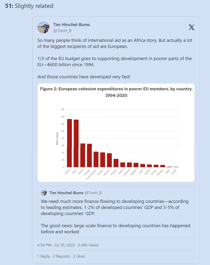
Scott asks:
Has anyone researched whether we should update towards international development aid working better than expected, vs. just assume that this is an effect of being in the EU (or being a country which has just cast off communism) which is only coincidentally related to EU aid levels?
By “researched” he probably means something deeper, better sourced and more thorough than the analysis I’m about to present to you. Still, I’ll be optimistic and hope that maybe this post will motivate someone else to do a better job of analyzing the data, and arrive at a more definitive answer to Scott’s question.
For now, let me try to answer in a not-so-definitive way.
Notice that the tweet’s author, Tim Hirschel-Burns (hereafter THB), claimed that poorer parts of the EU “have developed very fast“, not that they have closed their income gap with richer parts of the EU. But what is “developing“ if not converging, at least partially, towards the income levels of richer countries?
The term “developed country” has been in use since at least the 1970s, and there are now many non-rich countries whose citizens enjoy better material and social indicators than the richest countries enjoyed in the 1970s. The only meaning of “developing” that makes sense in this context is income growth and convergence. In fact, some of the biggest recipients of EU funds were already classified as developed by the IMF before the 1990s1, yet they have continued “developing” simply because their economies have continued to grow.
I’m aware that THB (and perhaps Scott) may not regard Spain, Portugal and Greece as “poorer parts of the EU”2. But they clearly were the poorer parts in the 1990s, before the EU’s eastern expansion to include the former communist countries.
Therefore, I will consider both southern European countries and the former communist countries of Eastern Europe as the poorer parts of the EU. I’m also including Italy in this analysis because, although it was not poorer than average in the 1990s, it contains some of the poorest regions in the EU.
The treatment
Now, regarding those EU funds, I wasn’t able to find data for the years before 20073. That year happens to be the year when the second major expansion of the EU took place, bringing Bulgaria and Romania into the EU. Three years before that, in 2004, the first major expansion occurred with the accession of Poland, Slovenia, the Czech Republic, Slovakia, Malta, Cyprus, Hungary and the three Baltic countries.
Before 2004, when these countries were still candidates for accession, they received EU aid through the PHARE and ISPA programs, but the yearly amounts from these funding schemes were an order of magnitude smaller than the cohesion policy funds they have been receiving since joining the EU.
So bear that in mind: southern European countries were already receiving generous amounts of aid since the mid-1990s (more than other EU members because they were poorer), while the former communist countries only began receiving comparable levels of aid from 2004-2007.
How much aid? This much:
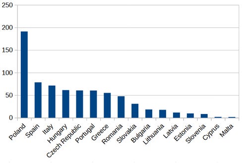
(I cannot reproduce the exact amounts that THB shows in his bar chart. This is partly because I’m restricting my analysis to the 2007-2020 funds, though that may not be the only reason. In his tweet THB said: “From 2007 to 2013, Poland received €58 billion in EU funds“, but I can’t reproduce that figure4. I get a total of 68.0364 billion euros for the 2007-2013 period, and even after excluding all funding categories other than “Non-repayable aid”5 the total remains 67.2933 billion. [UPDATE: The difference between THB’s 58 billion for Poland and my figure of 68 billion may be due to ESF funds. THB’s source (Prota, Viesti and Bux) only reports ERDF and CF funds, omitting ESF.])
Those funds are the treatment that southern and Eastern European countries received. Notice that Italy (absent from THB’s chart) also received a substantial amount of aid, similar to that received by Spain.
To measure the results of this treatment, I’ll use the World Bank’s GDP per capita PPP (current international dollars) data6. But instead of translating income growth into a compound annual growth rate, I will simply show the factor by which income increased beginning in 1994-19957.
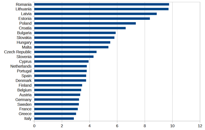
The final year I use for GDP per capita PPP is 20258 (THB used 2024). Since I also included all northern European countries in the chart9, you can see that the income growth of southern European countries falls within the range of the old (pre-2004) EU, with Spain and Portugal near the top of the old-EU range, while Italy and Greece are at the bottom of the range.
As for the former communist countries, they all show very impressive income growth. Slovenia, the Czech Republic and Hungary show the smallest increases (consistent with the annual growth rates presented by THB), while Romania, Lithuania and Latvia record the highest growth; which is a bit surprising since Romania and Latvia do not appear at the top of THB’s chart. This might be related to his use of constant dollars, instead of international dollars.
I will now try to measure whether there is any relationship between the amount of aid each country received and its rate of growth. But first, I’ll convert the amounts of aid to per capita aid. It’s not the same for Estonia, a country of 1.4 million people, to get a billion euros in aid, than for Poland (population 38 million) to receive the same amount.
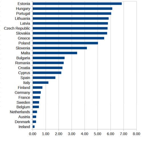
Sweden, for example, has a population of approximately 10 million people and received 4.9 billion euros in aid during the period 2007-2020. Therefore it got (in “per capita” terms) a little under 0.5 billion euros per million population.
To check whether higher per capita aid translated into more growth, I calculated Pearson’s r (correlation coefficient) between the two variables for all EU countries10. And the result is 0.435. Not bad!
It is not a particularly strong correlation, yet it is strong enough to suggest that more aid predicts faster economic growth. In fact, a simple regression on the data returns a p-value 0.026, which is also pretty good. But before claiming victory, let’s run a few sanity checks to make sure the correlation is as strong as it seems.
Sanity checks
I used 1994-1995 as the starting point for measuring GDP growth so that my results would be comparable with THB’s. But, since Eastern European countries received relatively little aid before 2004 or 2007, it may be more appropriate to measure growth from 2005-2006 (average) onwards. Also, southern European countries received a large amount of aid during the 1994-2006 period. It might be a good idea to adjust upwards the per capita aid figures for these four countries, and then recalculate the correlation between aid and 1994-2025 growth.
Well, when I measure growth starting in 2005-2006, Pearson’s r goes down to 0.276 (p-value = 0.17). Alternatively, if I increase the per capita aid figures of Greece, Italy, Portugal and Spain by 50%, it goes down to 0.297 (p-value = 0.14).
So, more appropriate comparisons produce weaker correlations.
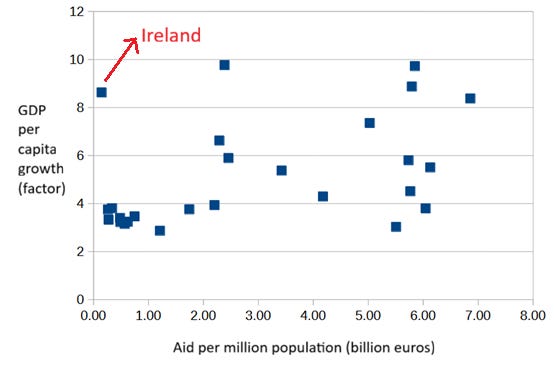
On the other hand, you may have noticed that I excluded Ireland from the GDP per capita growth chart. This was because of the infamous “let’s give American companies a way to avoid taxes by incorporating their international operations in Ireland” framework used by many large American companies to limit their exposure to the infamous extra-territorial American tax system. The establishment of these American subsidiaries in Ireland has artificially inflated Irish GDP (and thus GDP per capita) without a corresponding increase in living standards. This made me doubt the wisdom of including Ireland in this analysis.
Ireland’s very high (nominal) rate of economic growth, combined with the very low (in fact the lowest) amount of per capita aid it received, pushes the results of any analysis in the direction of concluding that high growth does not depend on aid, or that aid has little effect on growth11. But this is just an artifact of its inflated GDP.
If we exclude Ireland from the analysis, the initial correlation (beginning in 1994-1995) becomes stronger: 0.55. And a regression on the data without Ireland returns a p-value of 0.004, even better than before. Be aware that from now on, all analyses I present exclude Ireland.
Let’s do a final sanity check. If the rapid growth of the Eastern European countries is not simply an effect of casting off communism, then we should also see an effect of aid on the economic growth of the old EU countries, those that were members before the 2000s expansions.
And to some extent we do. The correlation coefficient is 0.34, although the p-value rises to 0.9. Even when Cyprus and Malta are included (not formerly communist, but new EU members), the correlation remains at 0.25 (p-value 0.38).
Slicing the Italian Panettone
Just like some European countries received more money per million population, some regions (e.g. eastern Germany) received more money than others (e.g. former Western Germany). And just as with countries, the poorer regions within countries received more EU funds12.
Should we take this into consideration in our analysis of the effect of aid on economic growth? I think that yes, we should.
Take the case of Italy. THB did not include Italy in his charts because in the 1990s the country as a whole was clearly not poor (roughly 30% richer than Spain). But that assessment applies only at the national level.
In the 1990s, just as today, southern Italian regions were substantially poorer than northern Italian regions. Sicily’s GDP per capita (PPP) in 2024 is 61% of the EU average and Campania’s is 64%, while in northern Italy Lombardy reaches 132% and Liguria 102% of the average. Many Eastern European regions are still poorer than Sicily or Calabria, but more than a few are now richer than southern Italy. Central Moravia’s GDP per capita PPP, for example, is 74% of the EU average and Estonia’s is 79%.
And the gap between southern and northern Italian regions has remained more or less unchanged from the 1990s until today. Between 2007 and 2026, consumption in Lombardy rose by 12.5%13 while its population increased around 10%. In Liguria, consumption fell 1.9% against a drop in population of around 4%, while in Sicily consumption decreased 13.2% even though its population only declined around 3%.
Looking at GDP per capita PPP in 2006 tells the same story. Lombardy’s was 26% higher than Liguria’s, while Campania’s was 36% lower14.
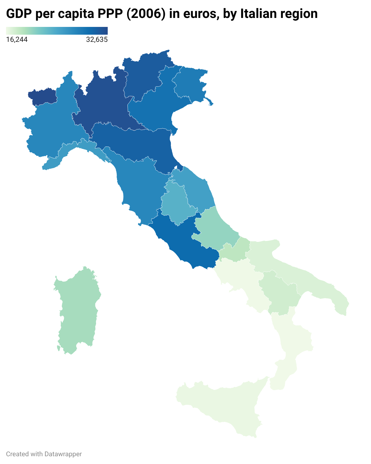
And looking at GDP per capita in the year 2000 (though not PPP) confirms the same pattern yet again: the richest northern regions had roughly twice the income of Sicily, Campania or Calabria.
The gap between Spain’s poorer southern regions and richer northern regions is not as wide as Italy’s15, but it is just as persistent. Examining the aid received by individual Italian and Spanish regions shows that the per capita amounts for the poorer ones fall in the same range as those received by Bulgaria and Romania16.
If EU aid accelerated economic growth, we should see a larger effect in the regions of Italy and Spain that received more funding than in those which received less. But we don’t. Poorer Italian and Spanish regions did not close the gap with richer Italian and Spanish regions. If we test the correlation between aid and growth among old EU countries again, this time treating Italian and Spanish macroregions17 as if they were separate countries18, the coefficient drops to -0.07 (p-value 0.75). Basically no relation at all19.
Ranking the Hungarian Goulash
I was going to check the effect of aid only among the formerly communist new EU members, as a way of controlling for the “formerly communist” factor, but instead I decided to run a regression model with a properly defined dummy (binary) variable for formerly communist countries.
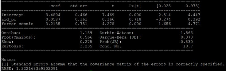
The regression results show that being a formerly communist country (variable “former_commie”) explains almost all of the variance in economic growth (p-value = 0), while aid per capita explains almost none of the variance (p-value = 0.718).
Just to be sure, I ran the same regression using 2005-2006 as the baseline for measuring GDP growth, and the results were the same.
And just to be extra sure, I decided not to use a simple dummy (binary) variable to identify the formerly communist countries. Instead of assuming all former communist countries to be the same, I asked my preferred AI to rank Eastern European countries by the degree of economic freedom they enjoyed during the communist era (you can see its full answer here20), and then used that ranking as an independent variable in the regression.
Tito’s Yugoslavia is well known for having been more economically free than the more orthodox communist countries, as I noted in a previous post:
Although Yugoslavia’s republics may not have been among the wealthiest in Eastern Europe, their economic system, characterized by self-management and elements of market socialism, fostered a relatively freer market environment:
Thus, for example, agriculture still remains by and large in private hands (85 percent) as do the various craft industries (240,000 private individuals engaged in everything from beauty shops and restaurants to repair shops). Such heterogeneity has imparted a unique economic system to Yugoslavia that is regarded by most observers as neither Western nor Eastern.
Yet, other communist countries, such as Hungary, also enjoyed a certain degree of freedom. In the case of Hungary, this relatively liberal system was known as Goulash Communism.
There are several ways to convert the economic freedom ranking into values between 0 and 1 (where 1 is completely communist system), so I tried a few of them21. In every case, the root mean square error22 was smaller than in the dummy variable regression, and the Beta coefficient was larger. This suggests that economic growth is not only associated with a country having been communist, but that the less economic freedom a country experienced under communism, the faster it grew from the 1990s onwards.
I highly doubt this result is sensitive to the choice of beginning and ending years of the analyzed period. I also doubt it depends on the definition of which EU funds qualify as aid (I ran an exploratory test on this23).
I simply find no evidence that the rapid economic growth of the poorer European countries in recent decades had anything to do with European aid.
(Here’s the GDP and funding data I used for all my calculations)
The IMF declared Spain a developed country in 1979. Portugal and Greece followed in 1989.
But then, why did he include them in his bar chart and not Italy?
Source of data is the EU cohesion policy funds website.
Relatedly, “cohesion funds“ and “cohesion policy funds“ are not the same thing. THB seems to have used them interchangeably in the article linked in his tweet (“from 2007 to 2013, Poland received €58 billion from European cohesion funds“; though maybe just a typo?), but strictly speaking cohesion policy funds are (mostly) comprised of European Regional Development Funds (ERDF), European Social Funds (ESF), and Cohesion Funds (CF). Cohesion Funds are only allocated to infrastructural and environmental projects.
The four funding categories for 2007-2013 are: Non-repayable aid, Aid (loan, interest subsidy, guarantees), Other forms of finance, and Venture capital (participation, venture-capital fund). Since the last three categories are such a small share of the total, I simply included all four in my calculations. The funding categories for the 2014-2020 period are (notice that ERDF and CF are identified explicitly): CF, EAFRD, EMFF, ENI, ENI-contribution from ERDF, ENI-contribution from IPAE, ERDF, ESF, FEAD, IPAE, IPAE-contribution from ERDF, YEI, YEI ESF Matching Component, YEI Specific Allocation.
GDP per capita PPP is constructed to facilitate comparison across countries, but it’s not the best way to measure real economic growth within a single country. Please don’t interpret the growth factors presented here as real per capita growth.
I use the 1994-1995 average GDP per capita (PPP) as the starting point for three reasons: 1994 is the year mentioned by THB; it seems like a reasonable starting point, coming a few years after the end of communism; and I like using an average because it dampens the noise from any single-year event that might have impacted GDP.
Assuming the effect of aid on growth is likely to have some delay, it makes sense to measure growth a few years after the last funds were received.
Except for Luxembourg and Ireland.
I only excluded Luxembourg.
This is clearly visible in a scatter plot of aid per million population vs GDP per capita PPP growth. Ireland screws up the correlation that you can probably see in the scatter plot if you exclude it (try covering it with your finger).
In the case of Germany, of the 51 billion euros the country received between 2007 and 2020, 53% went to states of the former East Germany, 29% to projects in the former West Germany, and 18% to projects not linked to any particular region.
Source is Confcommercio, the Italian commerce and services confederation.
Source is the Italian National Institute of Statistics through Wikipedia. I can’t find the original webpage in istat.it, but I trust Wikipedia’s data is correct.
The richest provinces of Spain (excluding Madrid) are usually around 80% to 90% richer than the poorest ones.
Only South Italy (NUTS code ITF) and the Canary Islands (NUTS code ES7) fall below the 2-2.5 billion euros per million population range, with 1.92 and 1.37 respectively.
Macroregions as defined by the European Union’s NUTS standard (NUTS 1). Italy received 3.86 billion euros for projects not linked to any particular Italian region; the corresponding figure for Spain was 24.3 billion. I did not apportion these funds to any region. NUTS lookup table for the 2014-2020 cohesion policy funds data here.
Greece and Portugal I’ll continue to treat as as single national units (income gap between their poorer and richer regions is not as large).
If I include Cyprus and Malta the coefficient drops to 0.15 (p-value of 0.47). Still nothing.
Grok’s ranking of formerly communist Eastern European countries by the degree of economic freedom they enjoyed:
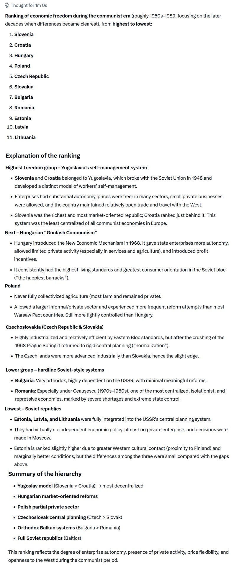
The ranked list of countries is: Slovenia, Croatia, Hungary, Poland, Czech Republic, Slovakia, Bulgaria, Romania, Estonia, Latvia and Lithuania. The value vectors I tried were: (0.4, 0.5, 0.6, 0.7, 0.8, 0.8, 0.9, 0.9, 1, 1, 1), (0.1, 0.2, 0.3, 0.4, 0.5, 0.6, 0.7, 0.8, 0.9, 1, 1), (0.5, 0.5, 0.6, 0.7, 0.7, 0.7, 0.8, 0.8, 0.9, 1, 1).
The root mean square error (RMSE) is a measure of the distance between the values predicted by the regression and the values actually observed. A smaller RMSE indicates the regression fits the data better.
I only included categories of 2007-2013 that sounded more growth-inducing: Agriculture, hunting and forestry, Manufacture of food products and beverages, Manufacture of textiles and textile products, Manufacture of transport equipment, Unspecified manufacturing industries, Mining and quarrying of energy producing materials, Post and telecommunications, Transport, Construction, Financial intermediation.
Then the question becomes: what happens to this money? Who benefits from it? Surely it doesn't evaporate.
Western EU countries have certainly helped eastern ones (“second world” countries) through four main mechanisms:
1. Tourism
2. Mass migration
3. Regulatory arbitrage
4. Direct market access
To take an example, Croatia is a country of 3.8 million with a GDPpc PPP of >usd 50k.
But it does not produce anything significant.
30% of the gdp is tourism + remittances. The emigration is so high that the country is losing population. There are more Croats that live outside Croatia than within it.
Regulatory arbitrage comes through obscure EU standards that would preclude companies in, say, China or India or Indonesia from participating in certain economic activities.
As an example, the latest amendments to EU’s waste shipment regulations require that lithium-ion batteries be only recycled in OECD countries.
This is ostensibly on “environmental” grounds but again the truth is that this is just economic protectionism.
This means limiting options to low cost eastern european countries for basic pre-processing and then shipping intermediate products to Korea or Japan for final processing.
This is because EU simply doesn’t have the cost structures for this kind of commoditized activity.
This is very ironic because China or India actually have excess capacity and do meet EU environmental standards but EU doesn’t want to let them in, which is understandable. But it is not stated as such.
Anyway so the bottomline is that the eastern european countries live off these scraps of the western euro ones.
It’s a sweet deal for everyone. Citizens of second world countries get to emigrate to first world without friction. First worlders get lower cost workers who are less troublesome than Moroccans or Algerians.
But ultimately this leads to de-population of the second world and de-industrialization of the first world.