
After seeing a very interesting post by my friend Khalil Gdoura in his Tunelyz newsletter I took an interest in the International Renewable Energy Agency (IRENA) and the data this agency publishes.

IRENA doesn’t just coordinate and promote the adoption of renewable energy, but also collects a wealth of information on renewable energy from its more than 160 member countries.
The focus for this article is on solar and wind energy as they are by far the two most important non-conventional (not hydro-power) forms of renewable energy and instead of just comparing the installed capacity for each country we decided to compare the density of installed solar and wind for each country. And by density I mean MW of installed capacity per each 1,000 square kilometers of area.
Here you can see a graph of wind capacity density for 164 countries.

Notice how Belgium, Denmark, Germany, the Netherlands and maybe even the UK have a much higher density than all other countries in the world. The fact that those are very windy countries is probably a factor in that high density.
And here is the same graph but for solar capacity density.

Countries with a very high density in this last graph, much higher than the rest of the world, are Belgium, Germany, Israel, Japan, the Netherlands, South Korea and Taiwan. And as you can see several countries have a high density of wind and solar: Belgium, Germany and the Netherlands, all of them in Northern Europe.
This made me wonder if I should look more closely at Northern Europe.
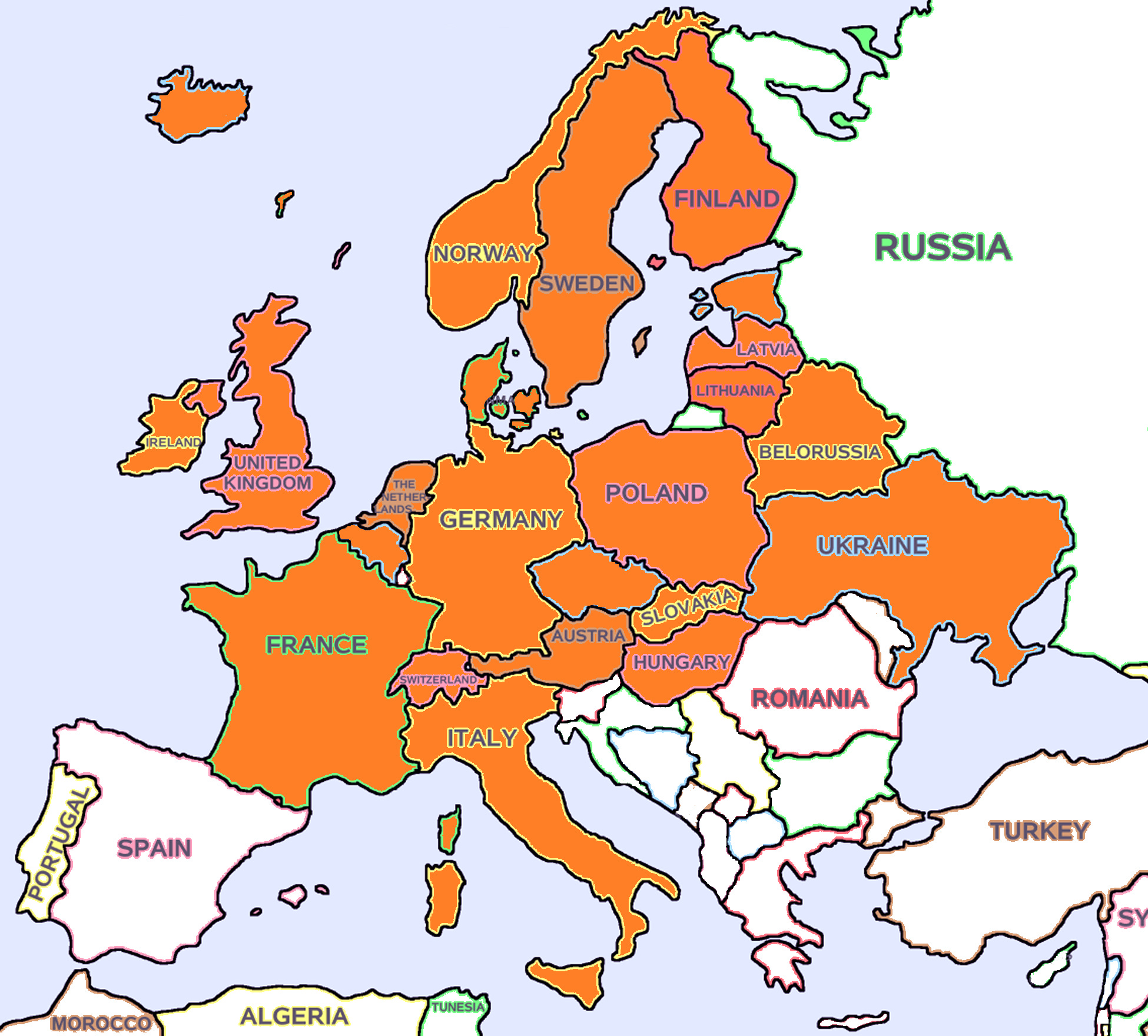
The previous map highlights all the 23 countries that we will consider for this analysis, most of them part of Northern and Central Europe and one of them, namely Italy, part of Southern Europe. More on Italy later.
The amount of solar radiation on a particular area depends on latitude and cloudiness (or lack thereof), and that means even though Central and Northern Europe are considered as temperate regions of the world they don’t get much solar radiation. The latitude of Central Europe is equivalent to that of Southern Canada, Mongolia or Patagonia. And having higher or lower solar radiation is a very important variable in how much electricity a solar cell will produce.
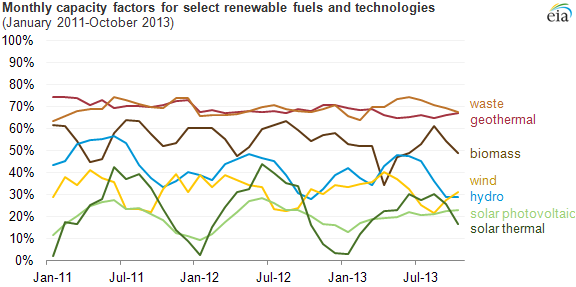
There’s no solar cell that will produce electricity 24 hours a day simply because the sun doesn’t shine 24 hours a day. And it should come as no surprise that all solar installations produce less than 50% of their nameplate capacity, usually much less, because they can’t generate during the night. That real production which is a factor of nameplate capacity is called capacity factor, and different technologies for producing electricity have different capacity factors which can also vary depending on fuel availability and other factors.
Now that we have a grasp of what a solar capacity factor means, let’s talk about the solar capacity factor for the those 23 Europen countries mentioned above. I’ll call them the Europe 23 from now on. The low solar radiation experienced by those countries would make me expect a low solar capacity factor, and that’s exactly the case. The average solar capacity factor for the Europe 23 is 10.28%. Not only that, but the average for the 8 countries with the largest capacity is just 9.98%.
The sunny countries
Now let’s take a look at another list of countries, 10 countries whose combined population is a little less than 400M people compared with the approximately 420M people of the Europe 23, and the solar capacity factor for each of these new 10 countries.
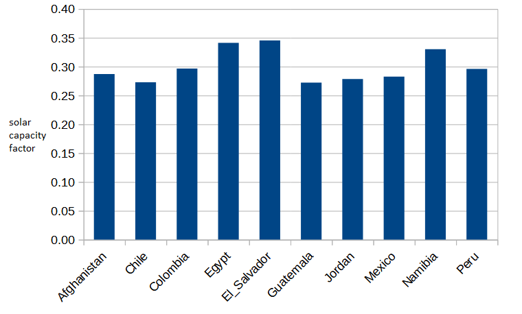
What these countries have in common is that they are sunny, or at least large parts of these countries are very sunny, and that explains why they have much higher capacity factors as shown on the table, with the average being 30.04%.
Now, let’s make a thought experiment. Suppose those 164,240 MW of solar capacity built in the Europe 23 had been built in the sunny countries instead. What difference would that make?
Assuming nothing else changes (cost of permitting, construction, etc… is the same), and assuming the capacity factor of the sunny countries remains the same even though their total installed capacity would grow approximately 10X, those 164,240 MW would generate around 284,300 GWh additional to the 146,980 GWh generated during 2021, because of the difference between a 10.28% capacity factor and a 30.04% capacity factor.
To put it another way, if those 164,240 MW of solar capacity had been built in the sunny countries, or equivalently sunny regions of the world, instead of the high latitudes regions of Europe that capacity would produce around 431,300 GWh instead of 146,980 GWh.
This is a back of the envelope estimate and should be taken with a big grain of salt. In particular, if 164,240 MW of solar capacity were added to the current solar installed capacity of the sunny countries that would mean increasing their solar capacity around 10 times, and there might not exist enough demand for that energy. Or there might not be enough coal-fired plants to close down if the objective is to reduce CO2 emissions.
To give some perspective on that number, total electricity production in the European Union was 2,785 TWh in 2021. The hypothetical 284,300 GWh that could be produced if the Europe 23 had the same capacity factor as sunny countries do would be 10.21% of that total. That is a large part of the total.
Even if we make the same comparison against the whole world - world electricity production is approximately 26,823 TWh - the hypothetical 284,300 GWh would be 1.06% of the world total. Not a trivial amount of energy.
Is it a good idea to keep building solar capacity in cloudy and high latitude areas of the world ?
A note on Italy
The reason to included Italy as part of the Europe 23 even though it’s not part of Northern Europe is because from the point of view of were its solar capacity is installed it partially looks Central European rather than Southern European. The 8 northern regions of Italy account for 38.4% of installed capacity, the 6 central regions (Tuscany, Marche, Lazio, Umbria, Abruzzo, Molise) account for 24.8% of capacity, and the 6 southern regions account for 36.8%.
Compare this geographic distribution to that of Spain, a country with a similar latitude, where 76.6% of installed solar capacity is in the South. And it’s no wonder then that Italy’s solar capacity factor is 12.7%, not much higher than the 10.28% average for the 23 European countries included in this analysis.
Think of the inclusion of Italy in the Europe 23 not because of it’s latitude but because of it’s low solar capacity factor. And think of the geographic distribution of solar capacity in Italy as a smaller scale example of the situation in the whole world.
And if you liked this short post, please subscribe.